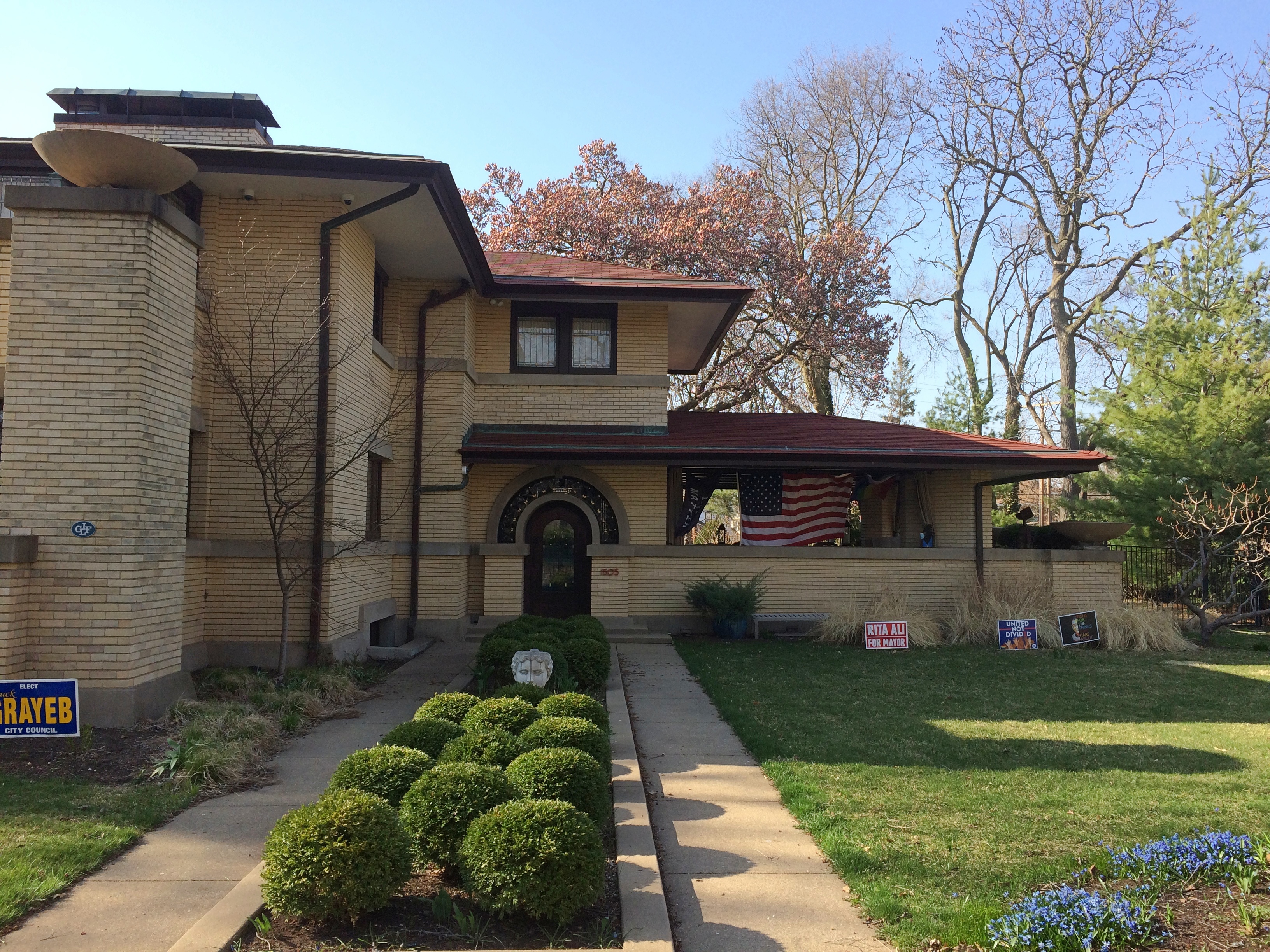
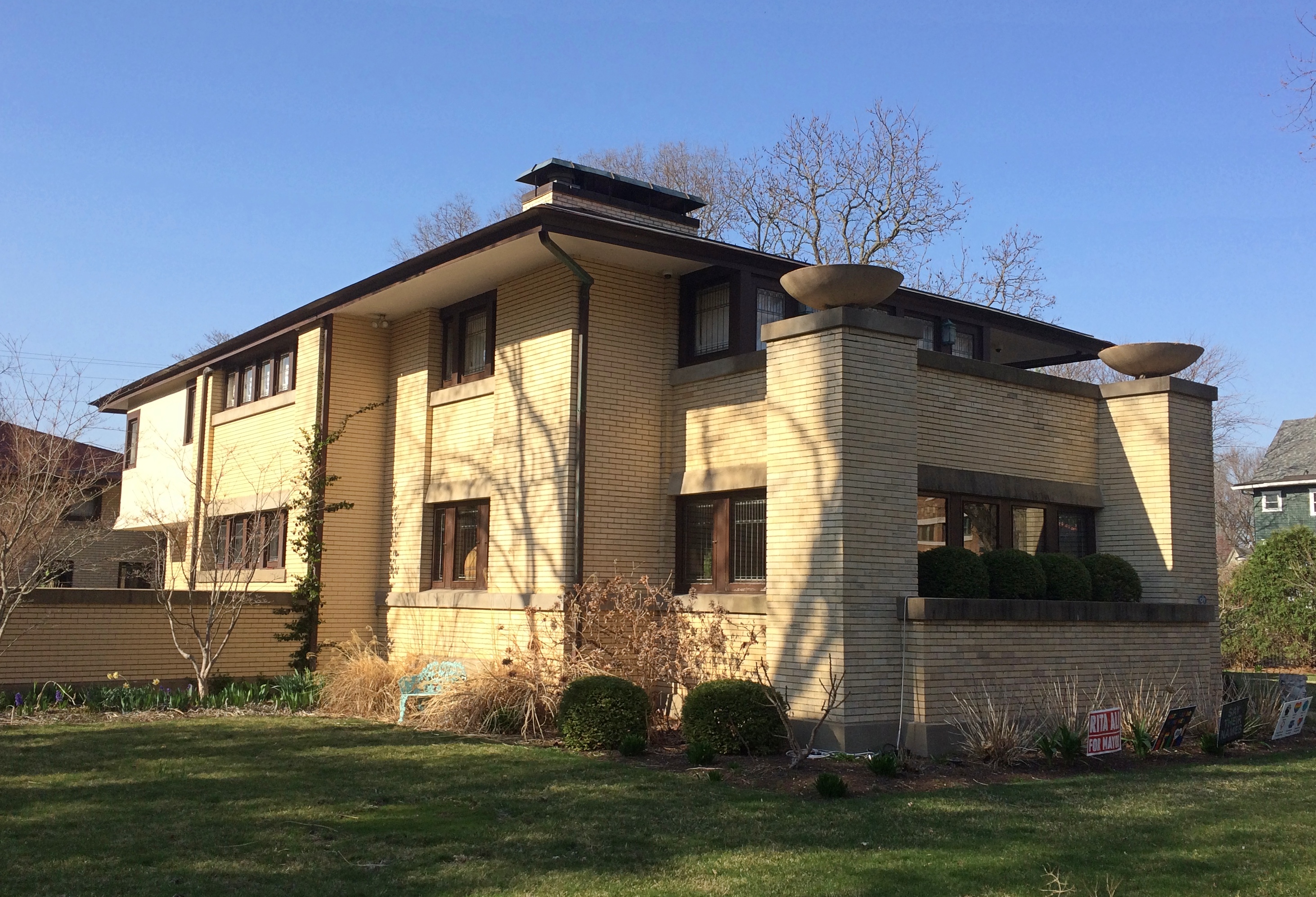
Just returned today from a series of long drives totaling 2,610 miles that took me down the length of Illinois and through parts of Missouri, Tennessee, Mississippi, Arkansas, Louisiana and Texas. Dallas was the prime destination, where I visited Jay for the first time in well over a year.
I drove on crowded Interstates, nearly empty Interstates, U.S. highways, state and county roads, and urban streets, and logged a lot of miles on roads through farmland, forests and small towns. I crossed the Mississippi more than once, including on a bridge that felt so narrow that moving the slightest bit out of your lane would crash you into the side of the bridge or oncoming traffic. Rain poured sometimes, drizzle was common and there was plenty of evidence of a wet spring in the ubiquitous puddles and the lush greenery of the South.
On I-20 east of Shreveport, I spotted a small truck carrying mattresses that had stopped on the right shoulder ahead of me. Then I spotted the mattress he’d dropped in the middle of the road, a few seconds ahead of me. The truck was 50 feet or so further than the mattress; he’d probably stopped to pick it up, but fortunately hadn’t got out of his truck yet. To my left another car was just behind me, so I threaded the needle to the right of the mattress and left of the truck, missing both.
I left metro Chicago mid-morning on April 9, making my way to Carbondale in southern Illinois, and took a short afternoon hike to the Pomona Natural Bridge in Shawnee National Forest. Overnight an enormous thunderstorm passed over that part of the state, and intermittent rain continued the next day as I drove through the southernmost tip of Illinois, a slice of Missouri, the length of West Tennessee and into Mississippi, arriving in Clarksdale after dark.
En route I’d stopped for a couple of hours at Fort Pillow State Park and about half that long in downtown Memphis. Dinner that night was Chinese food from a Clarksdale takeout joint called Rice Bowl.
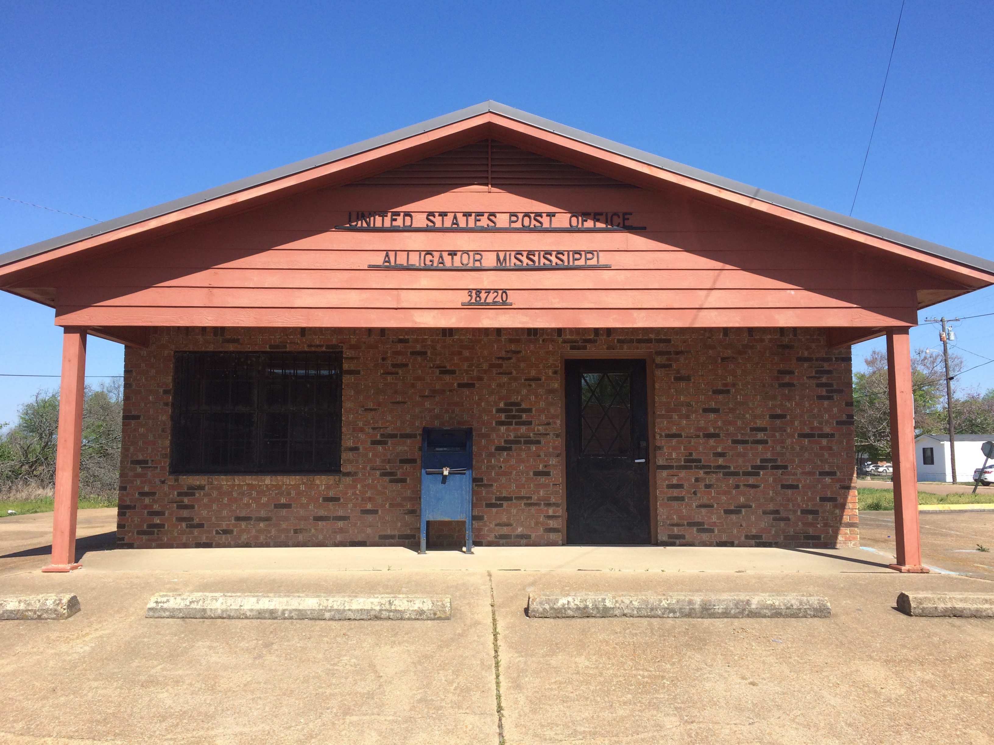
On the morning of April 11, I took a walk in downtown Clarksdale, then drove south — stopping to mail postcards in Alligator, Mississippi — and spent most of the afternoon at Vicksburg National Military Park.
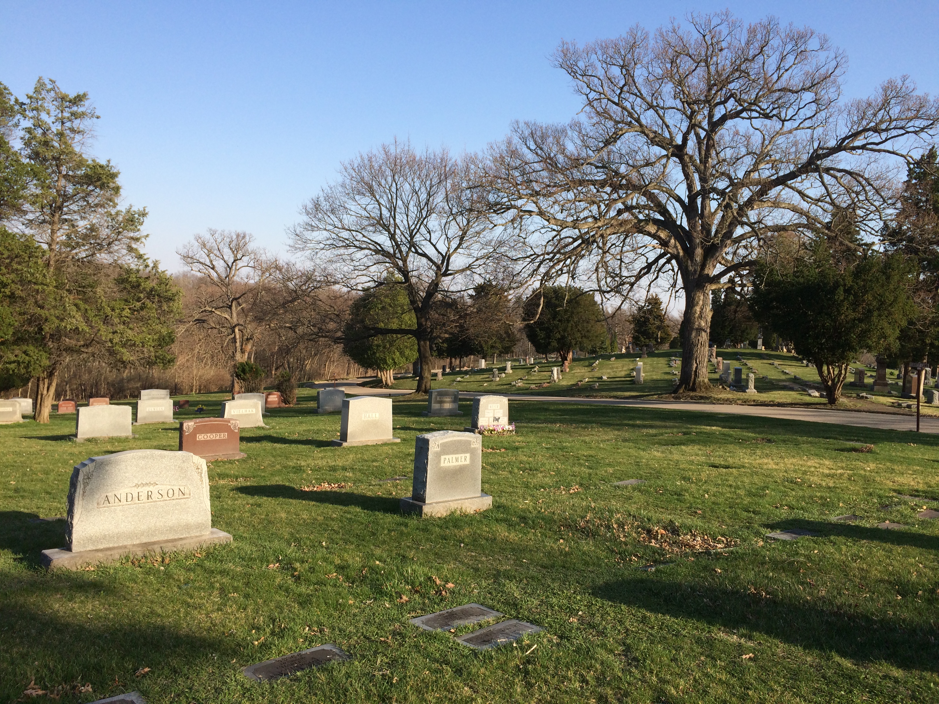
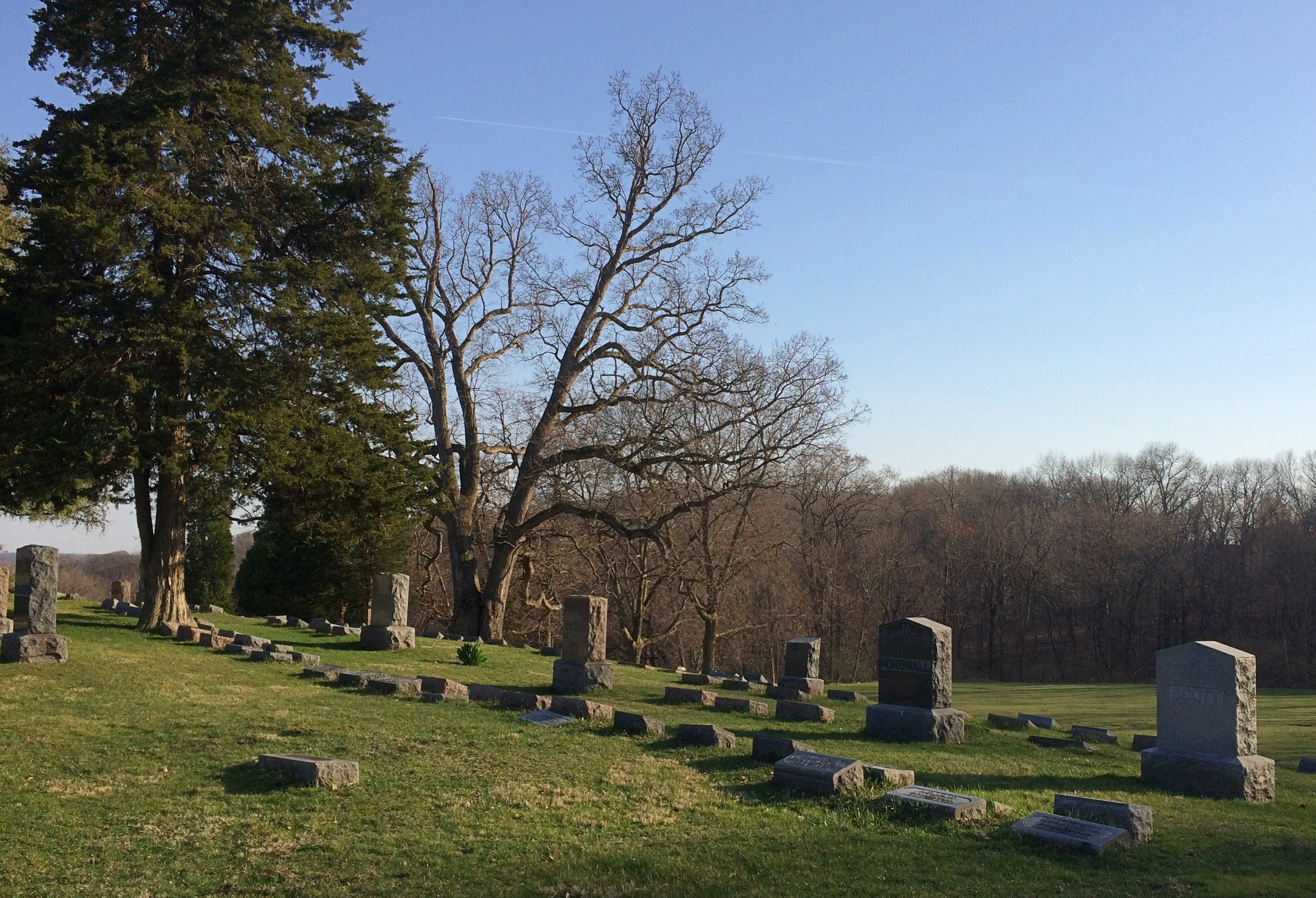
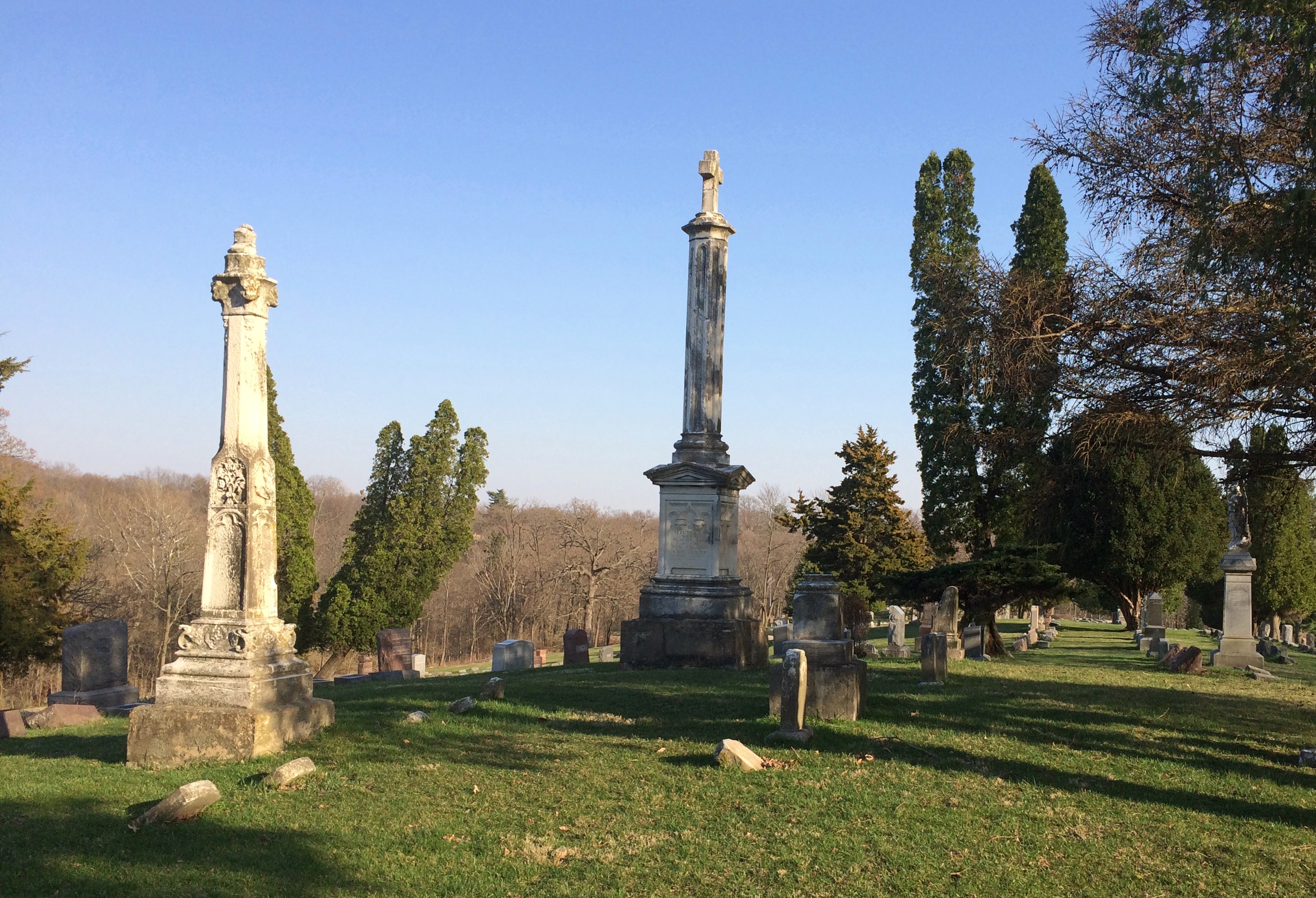
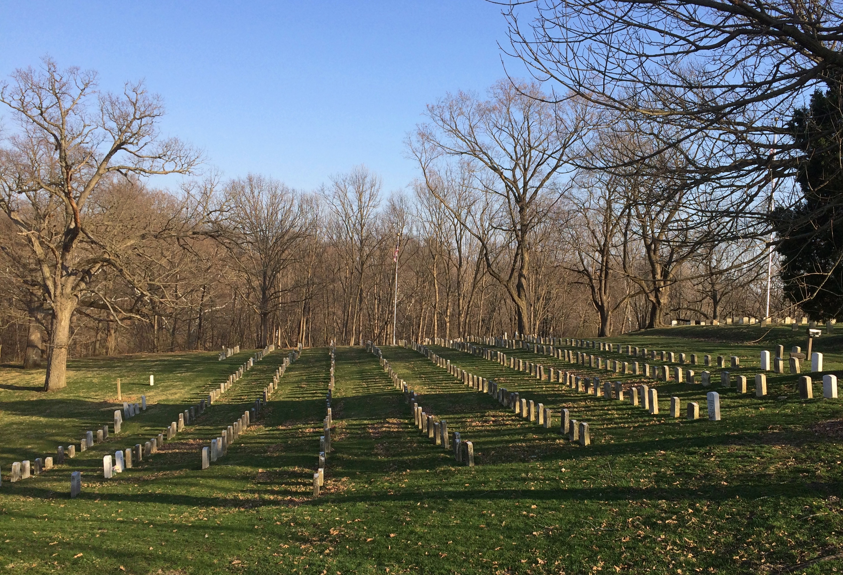
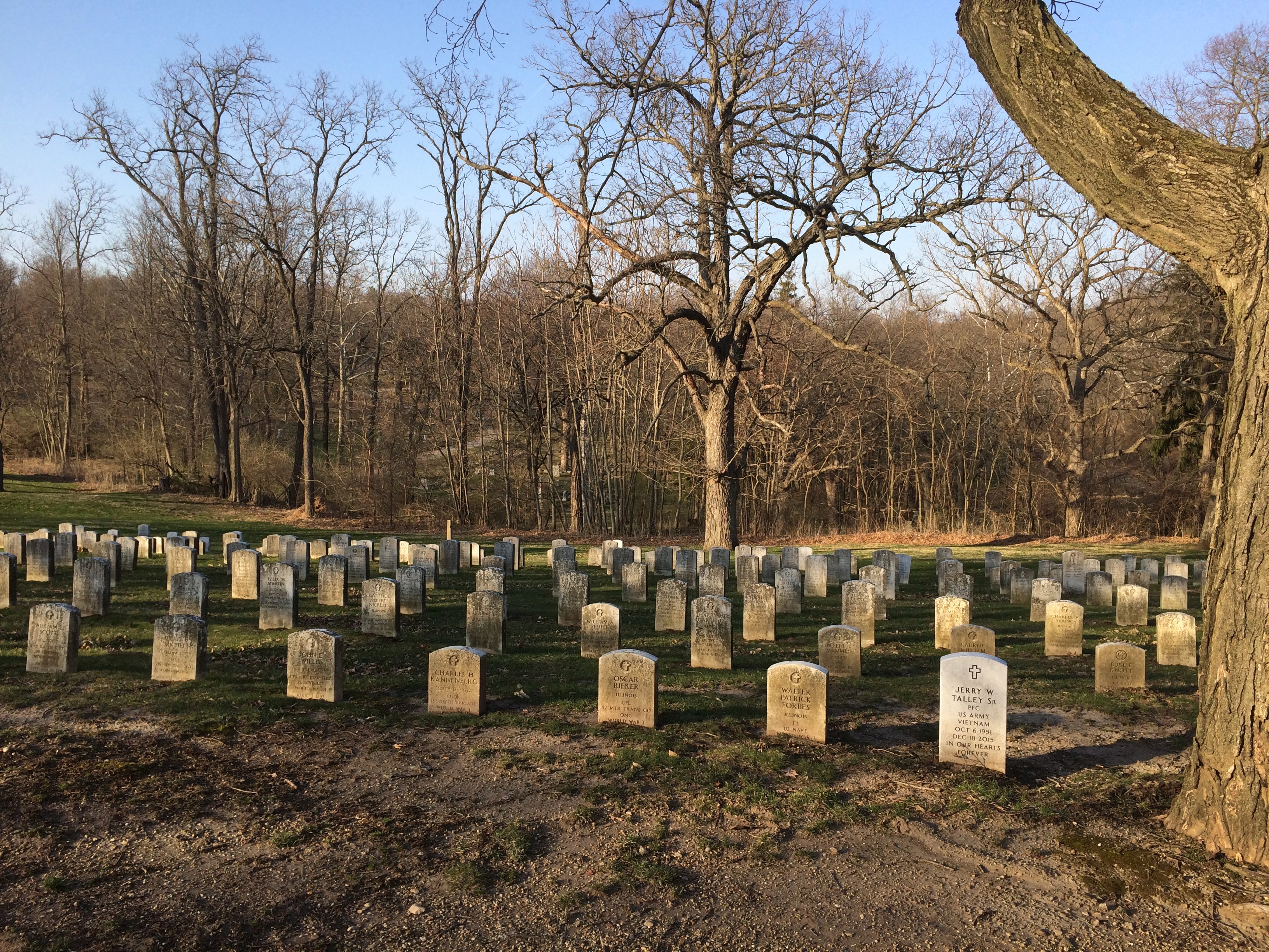
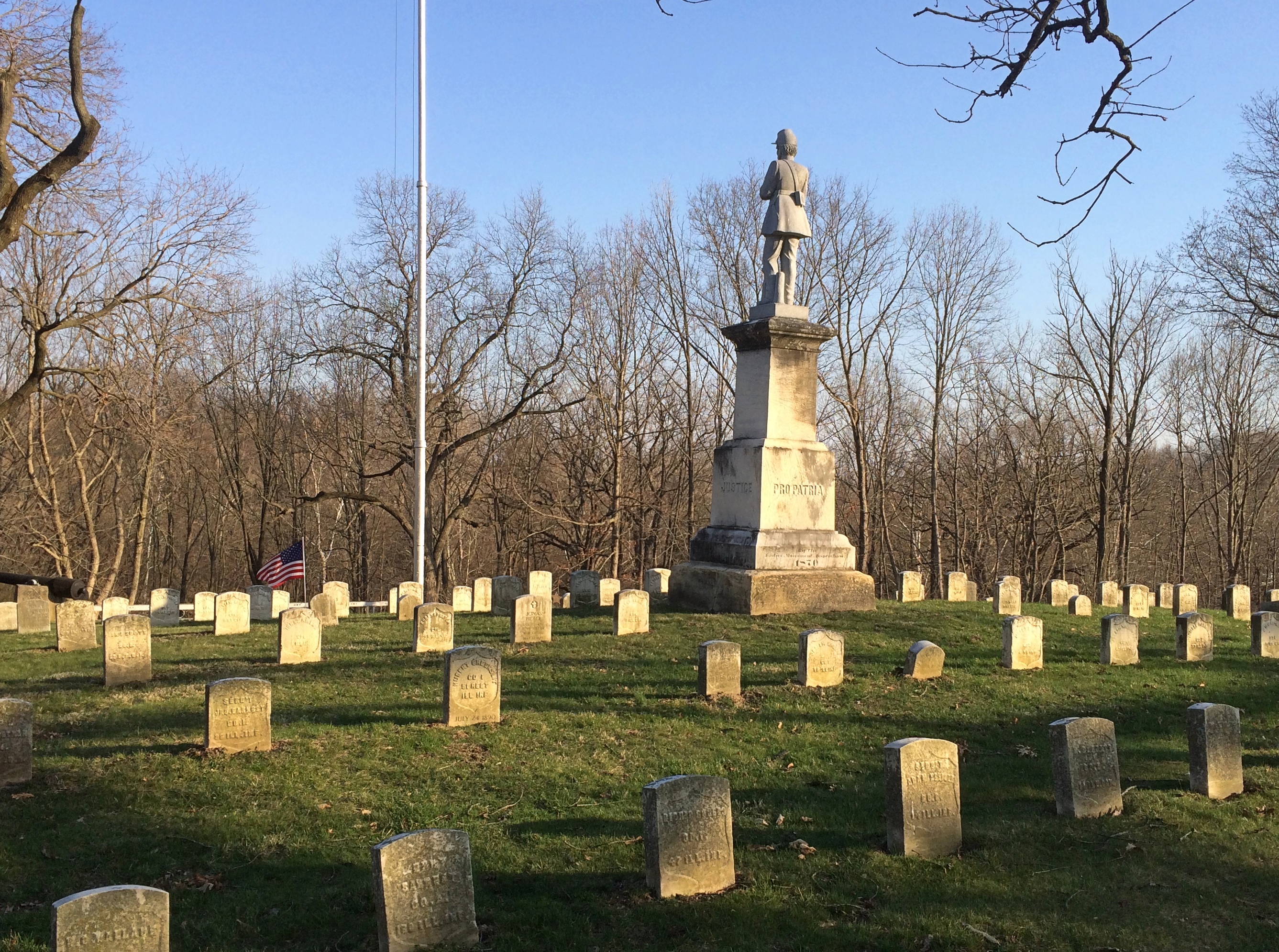
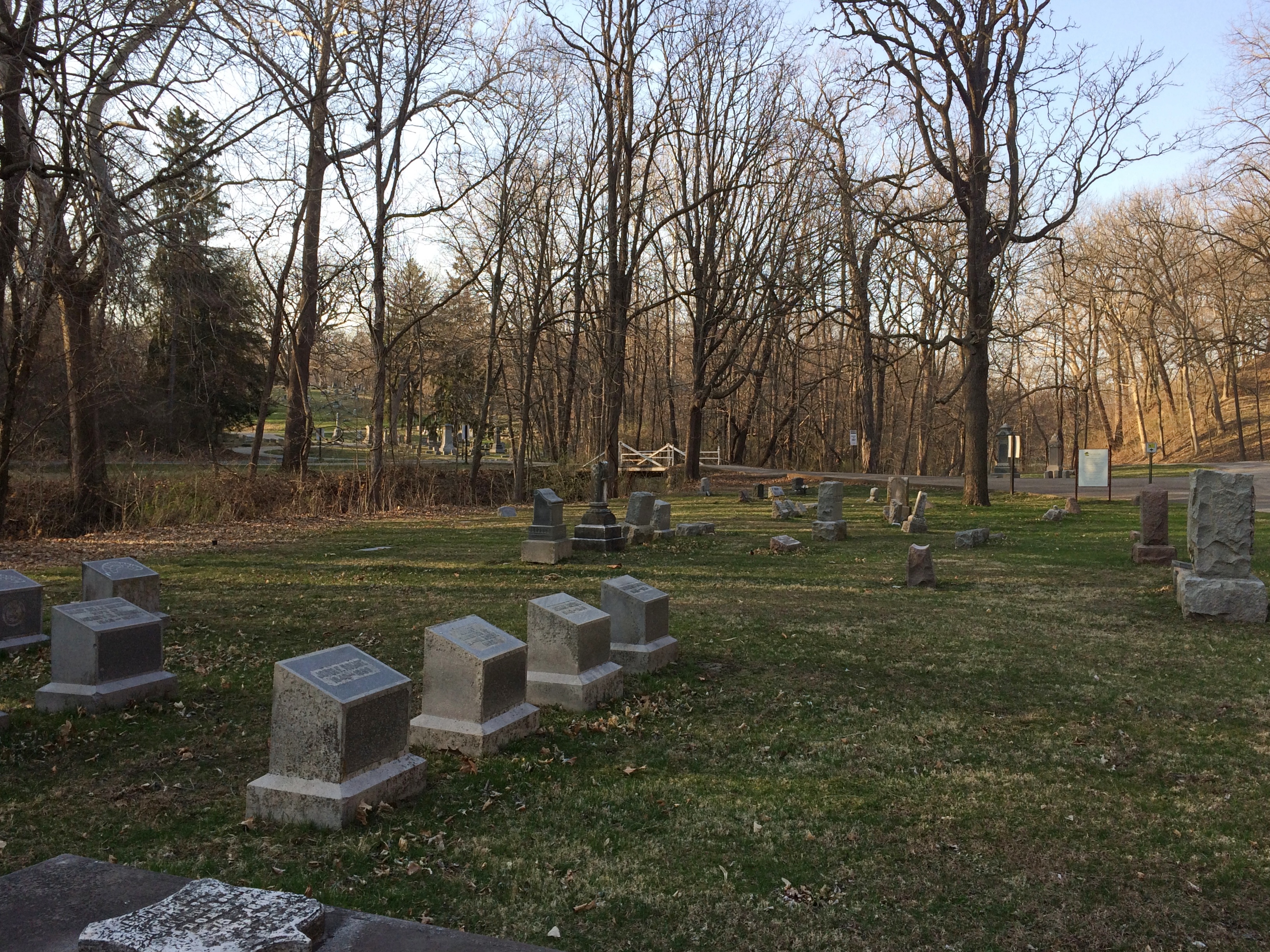
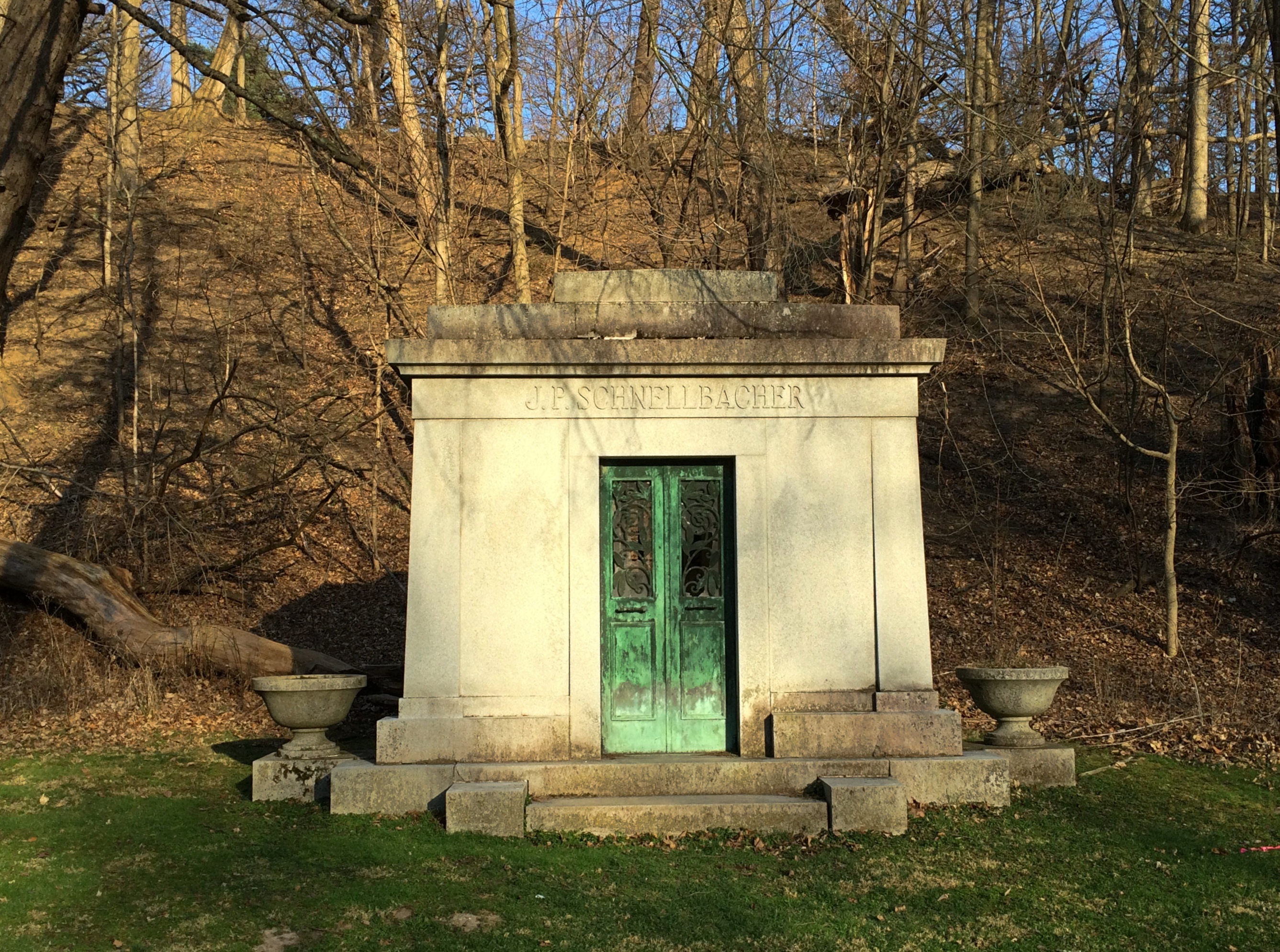
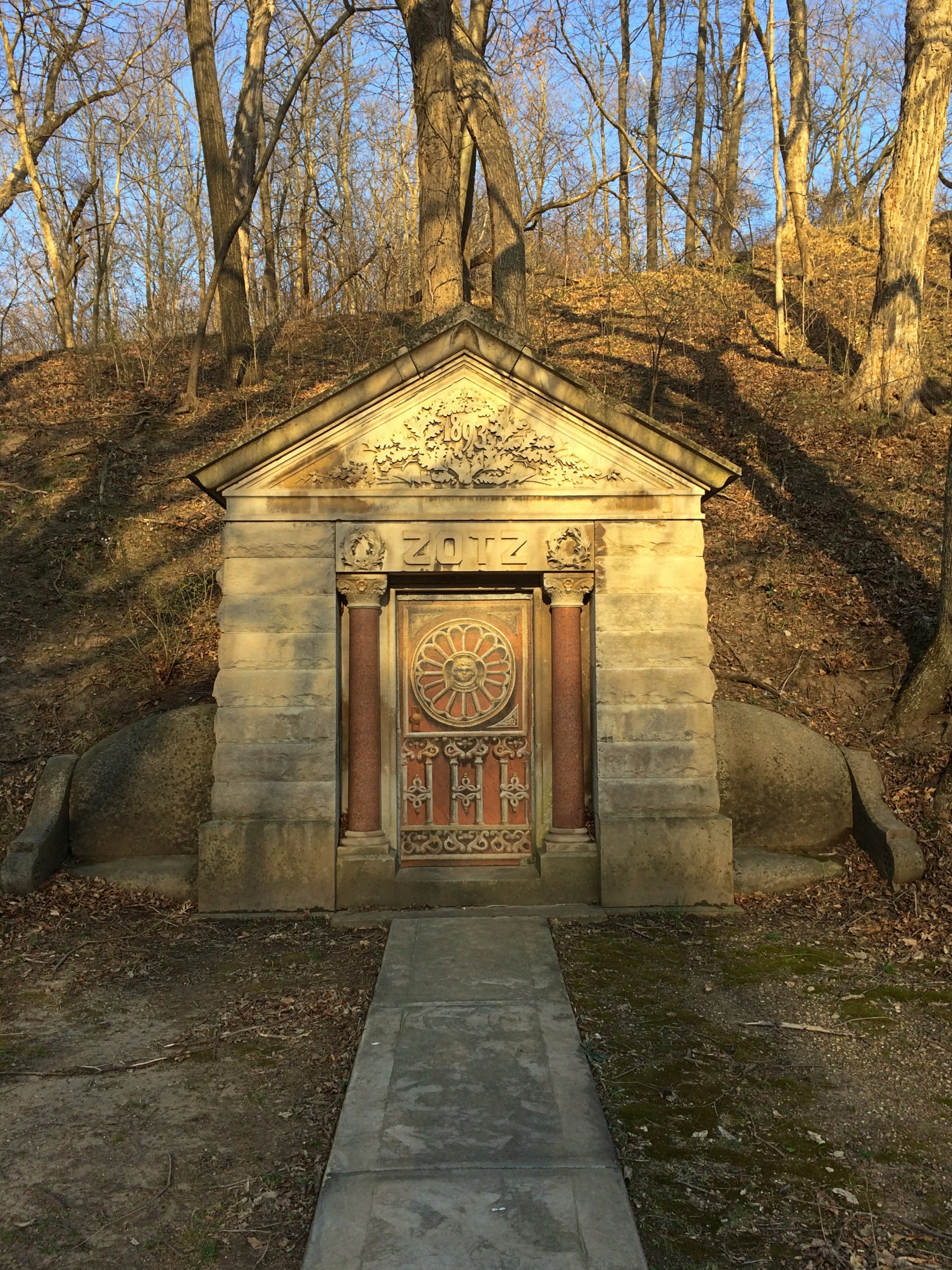
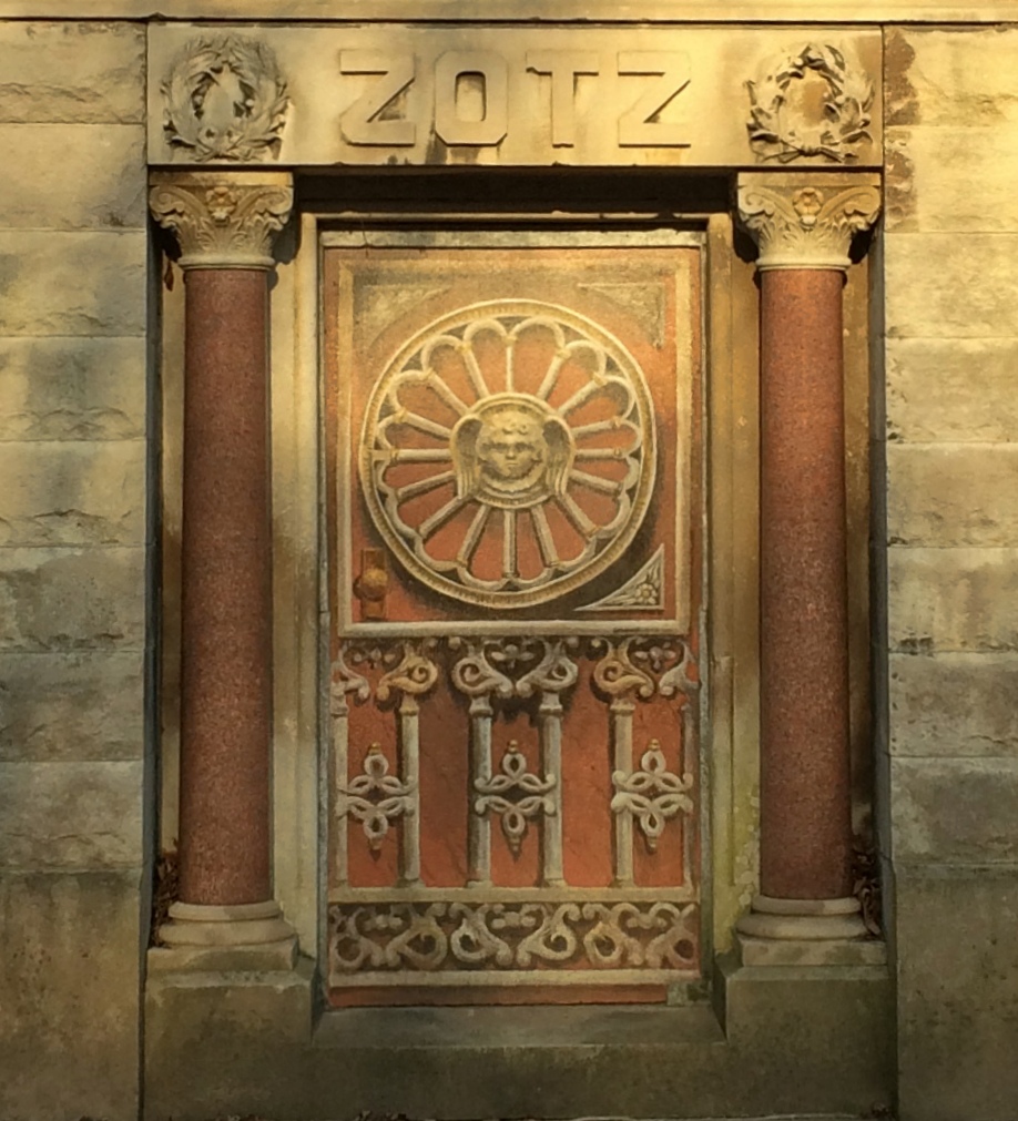
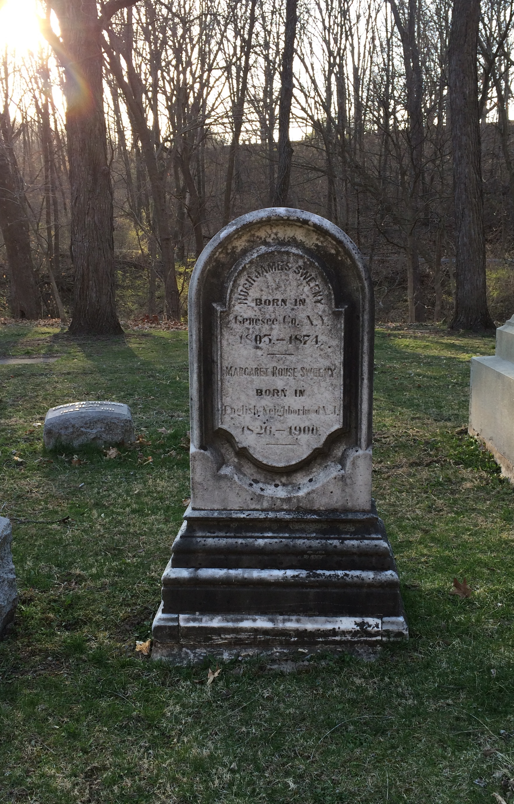
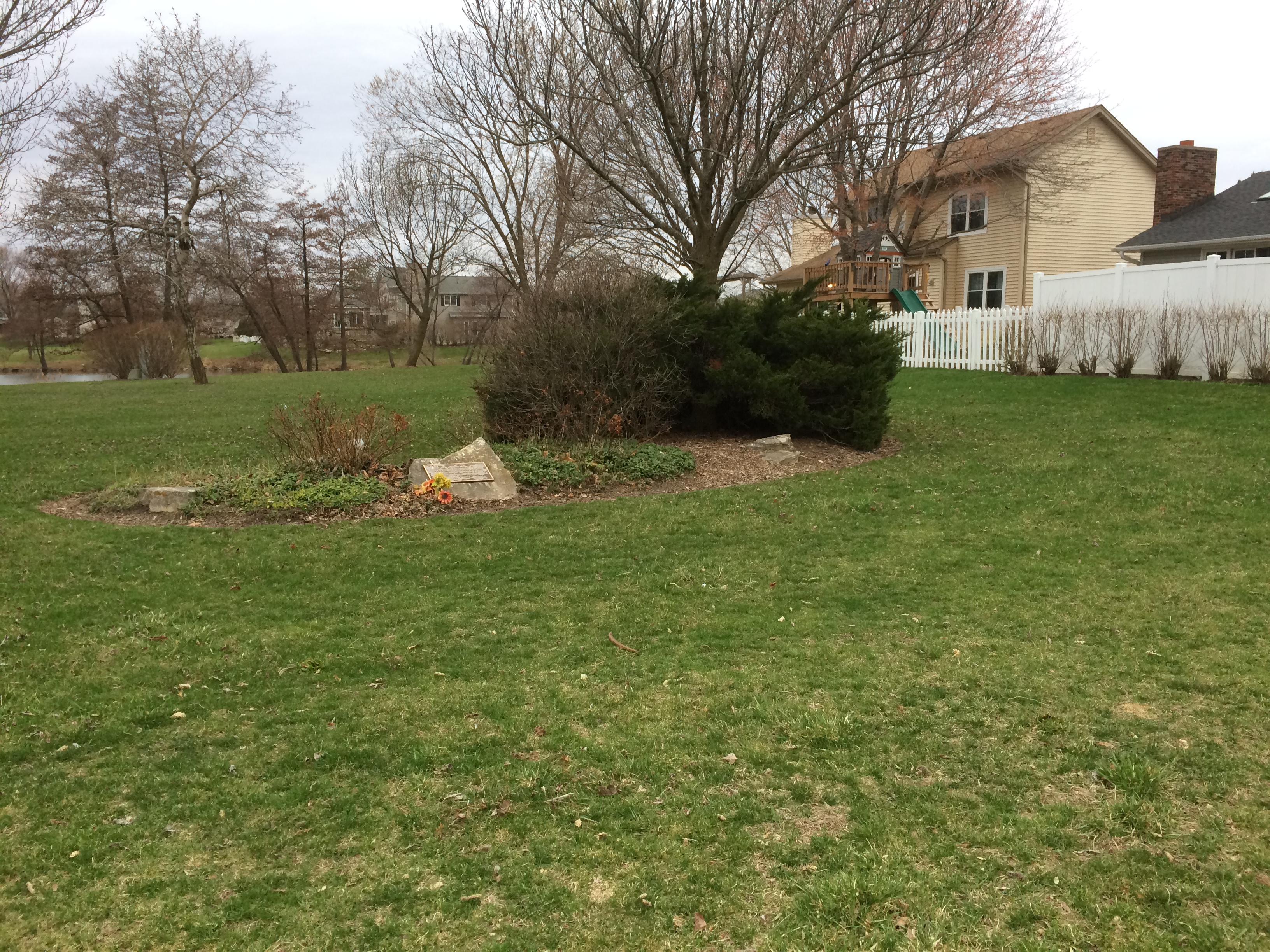
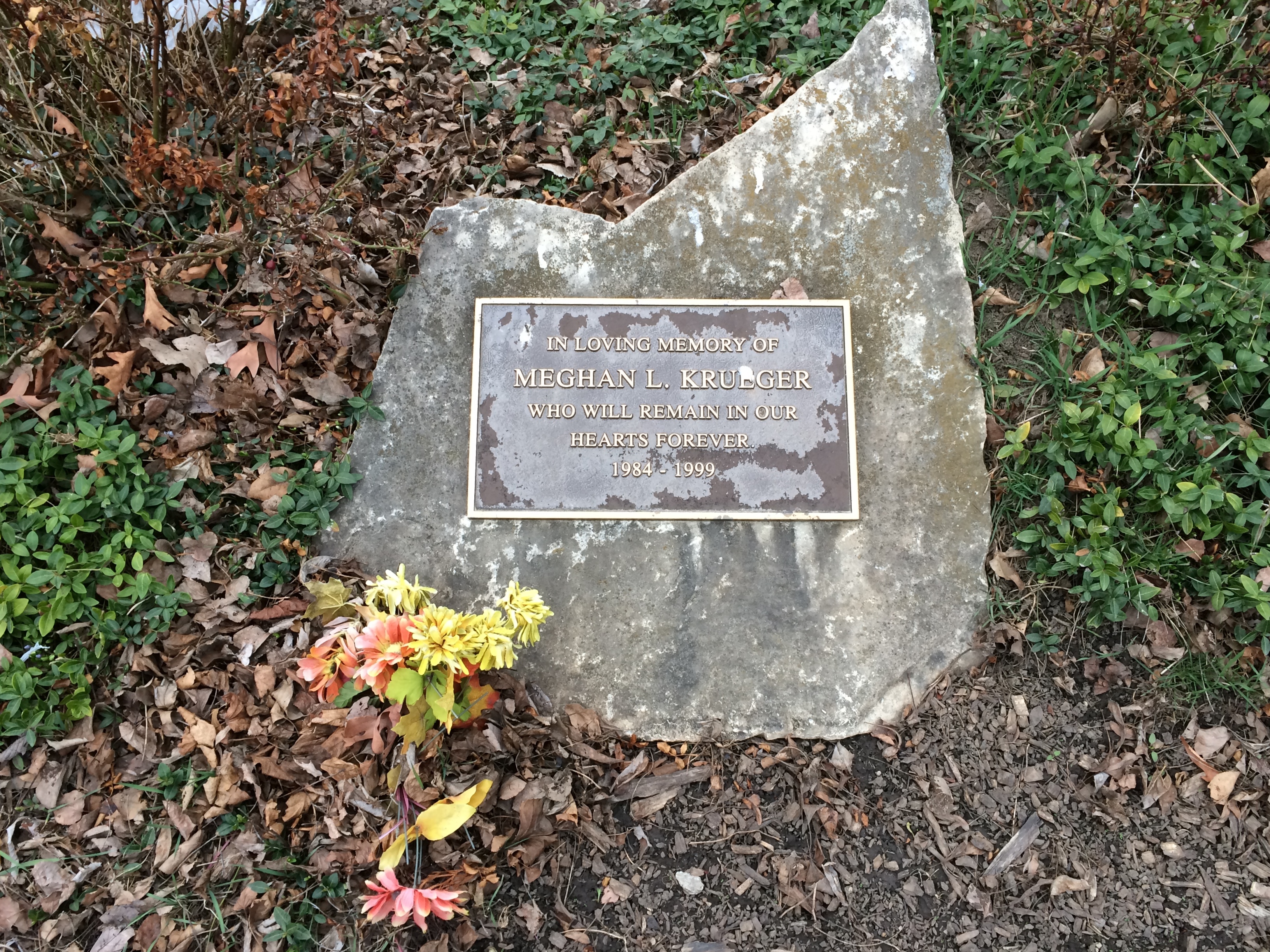
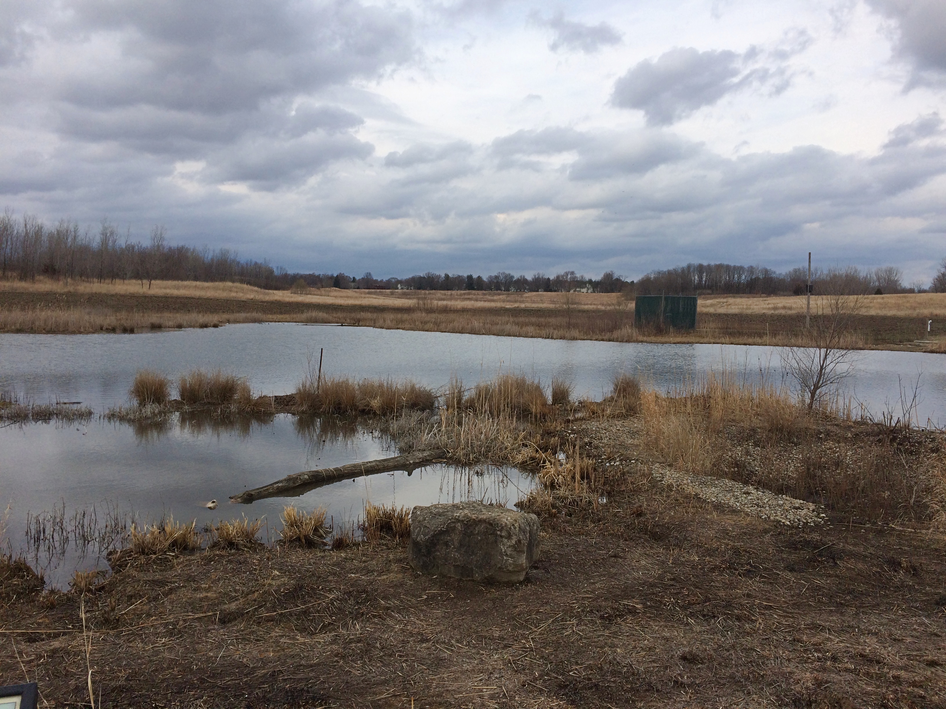
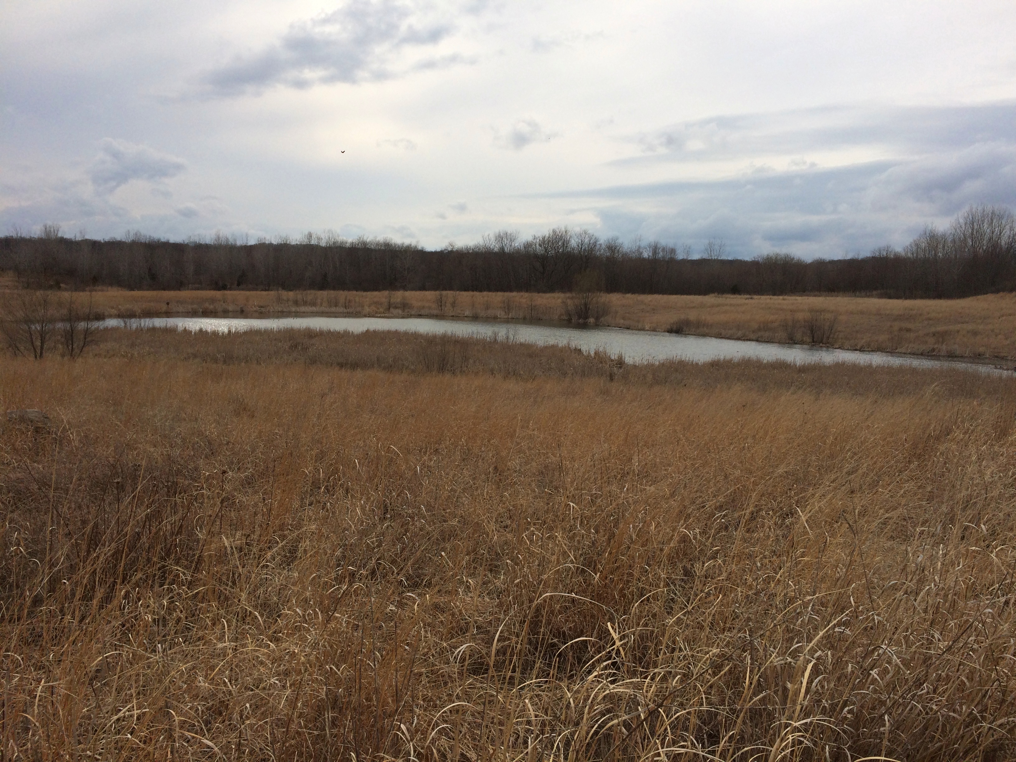
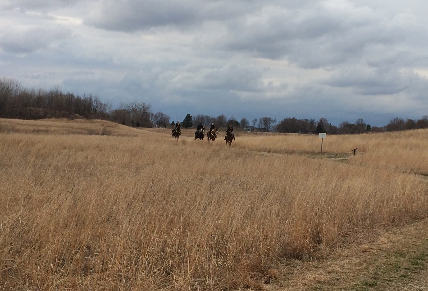
As the afternoon grew late, I walked around downtown Vicksburg and one of its historic cemeteries. The next day I headed west across the Mississippi River into Louisiana, where I stopped at Poverty Point World Heritage Site, locale of an ancient Indian settlement much older than Cahokia, or the pyramids outside Mexico City for that matter.
I stayed in Dallas from the evening of April 12 to the morning of the 16th, mostly at Jay’s house, though I did visit my nephew Sam and his family, meeting their delightful two-year-old daughter, my grandniece, for the first time.
On the 16th I drove north from Dallas, spending a little time in Paris, Texas. In Oklahoma I headed on small roads to the Talimena Scenic Drive through Winding Stair Mountain National Recreation Area, where I followed its winding (as the name says), up and down two-lane path through near-mountainous terrain. In a thick fog. That was excitement enough for one day, but that didn’t stop me from visiting Heavener Runestone Park toward the end of the afternoon. I spent the night just outside Fort Smith, Arkansas.
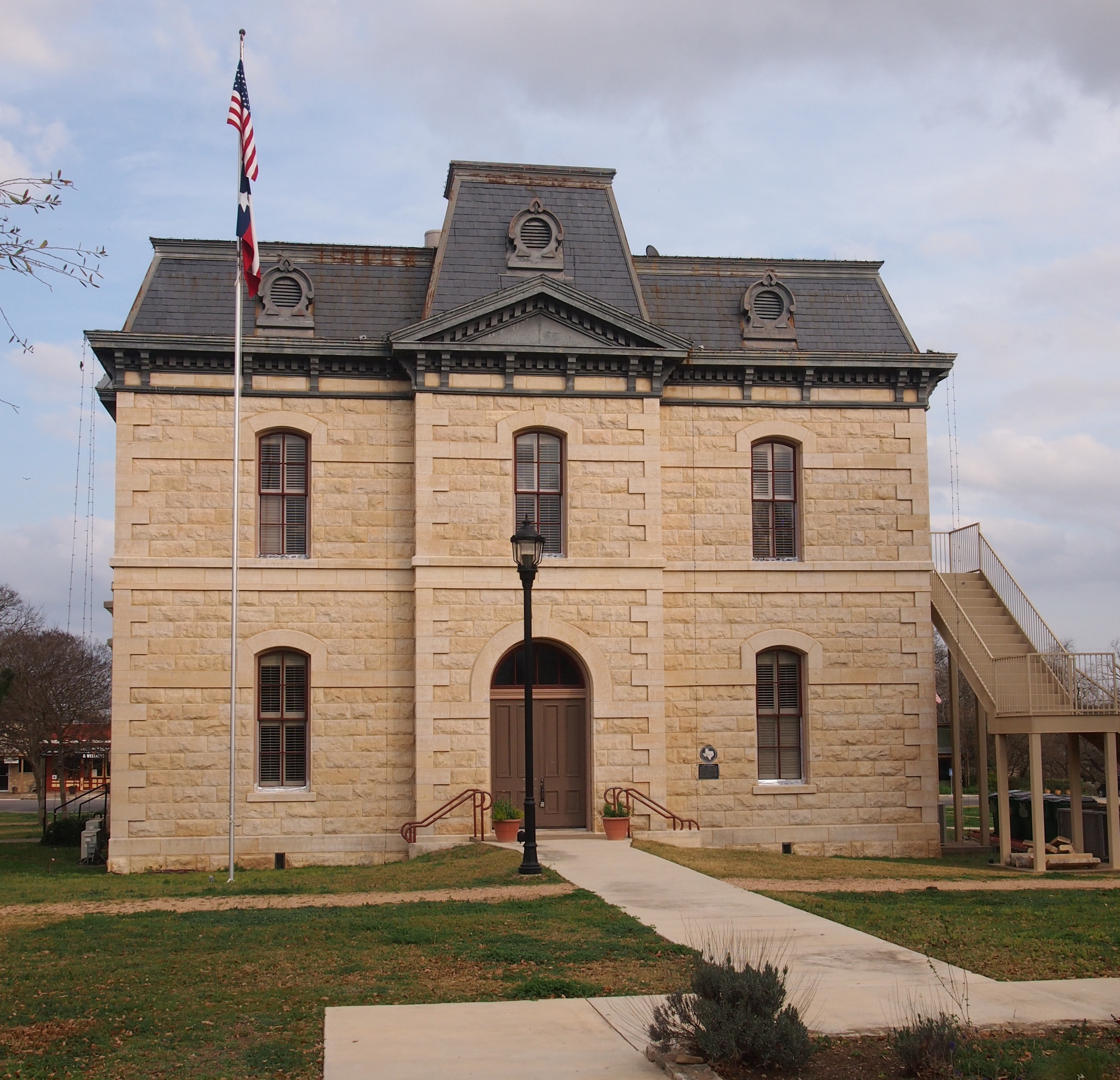
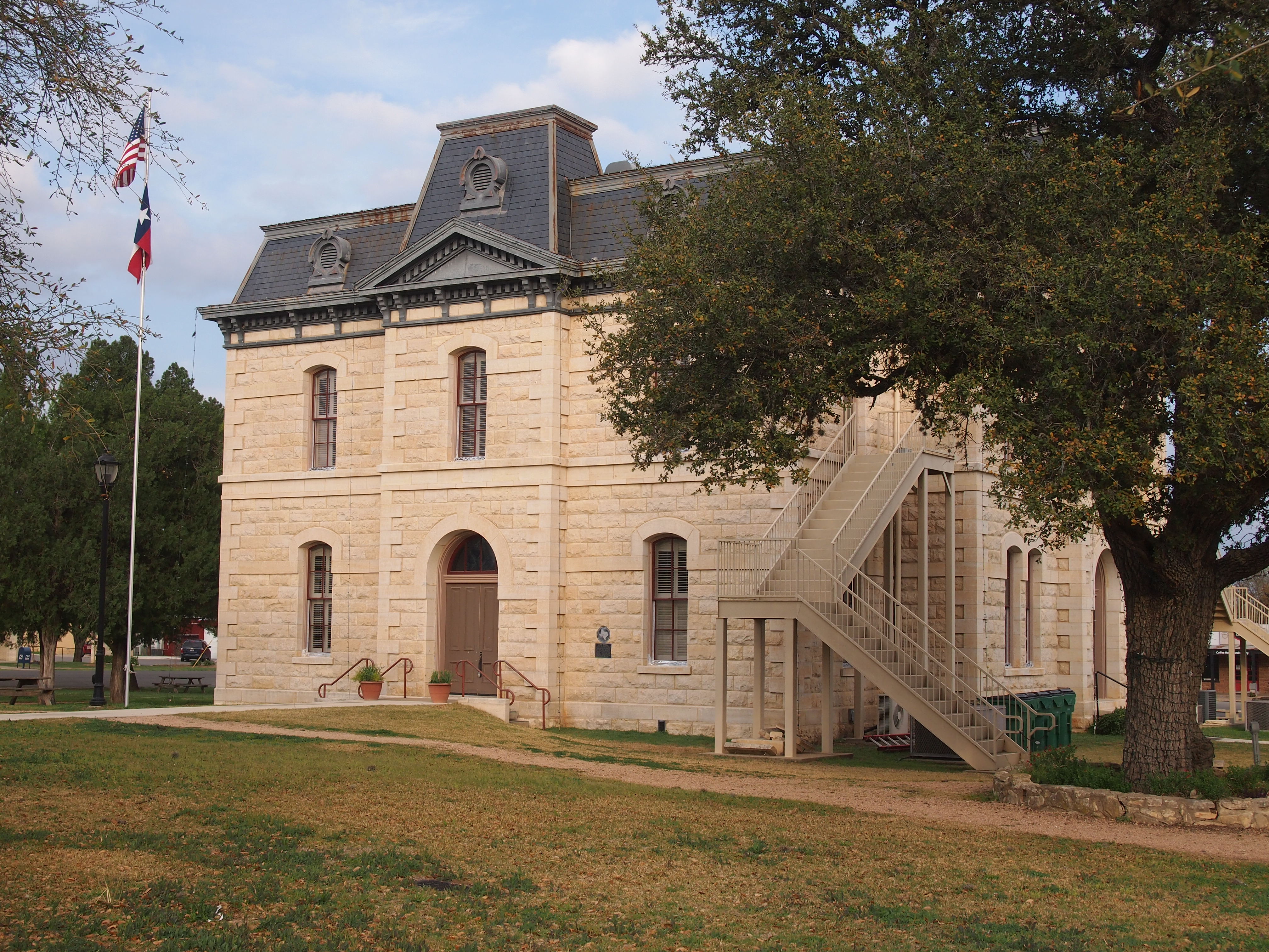
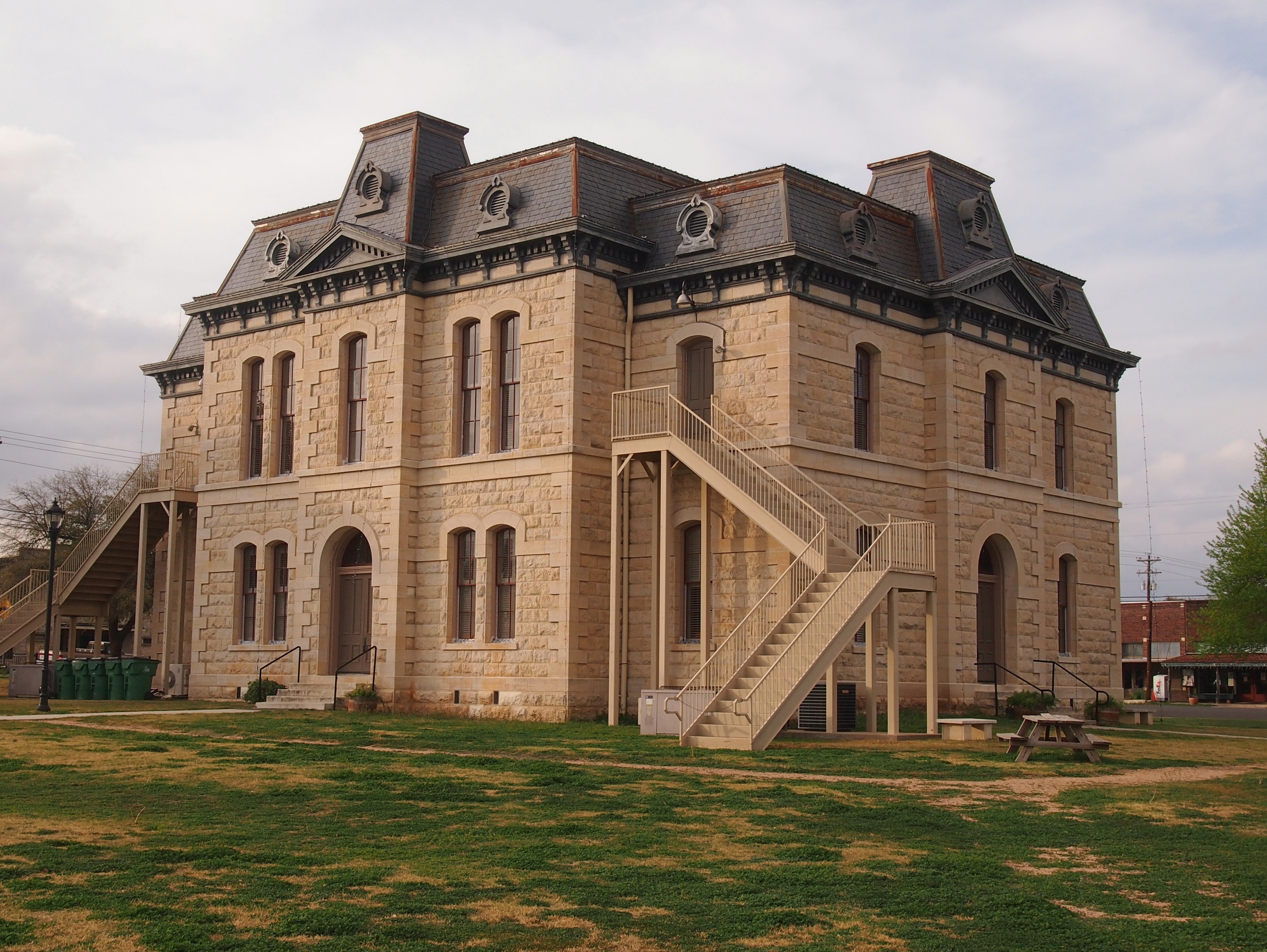
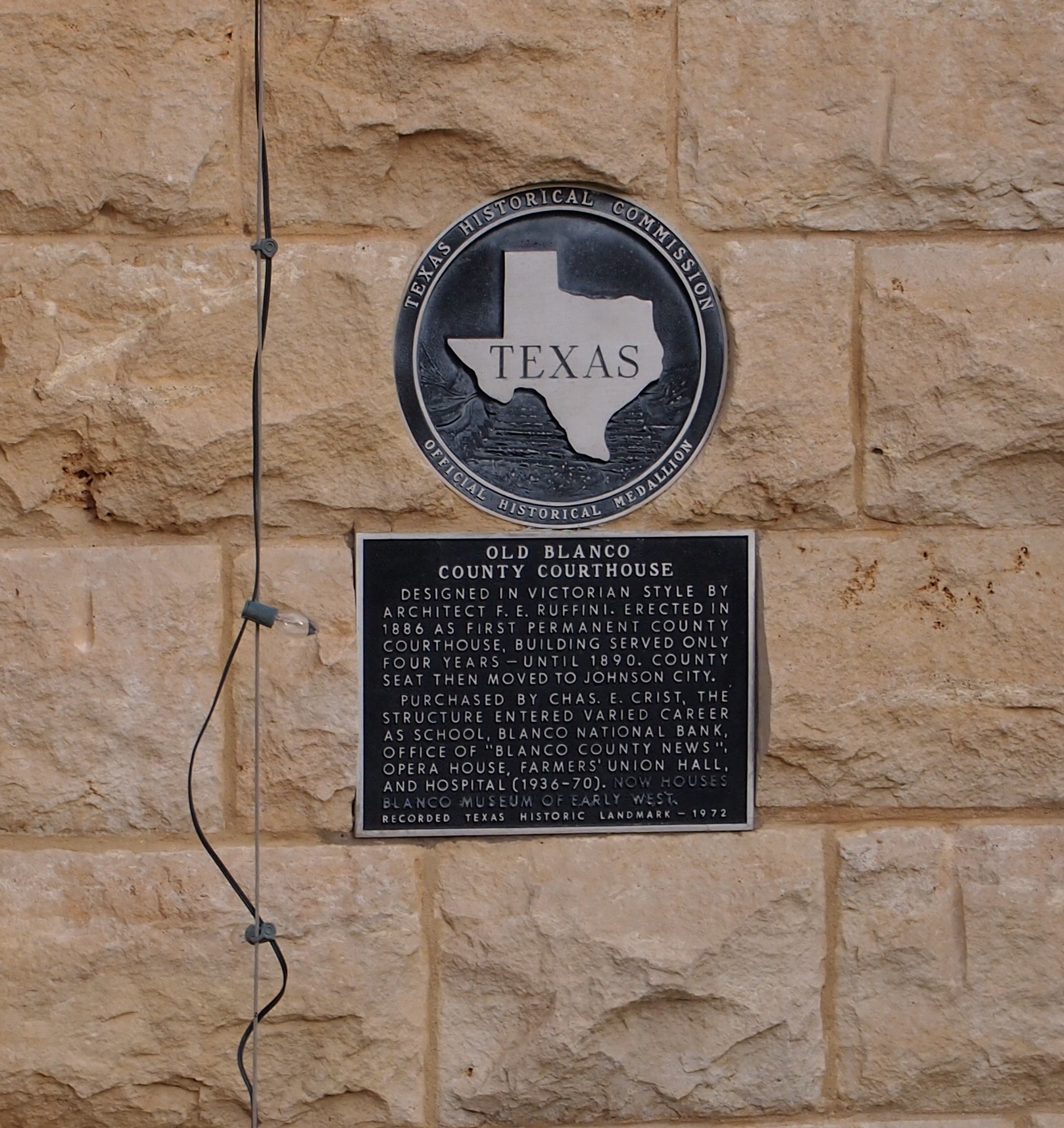
The next morning I headed toward Fort Smith and chanced across the picturesque Main Street of Van Buren, a large suburb of Fort Smith, or maybe its mate in a small twin cities. I also looked around the Crawford County Courthouse before crossing the Arkansas River to Fort Smith proper, spending an hour or so at Fort Smith National Historic Site. From there a long and tiring drive took me to Belleville, Illinois for the last night of the trip, stopping only for gas, food and a quick look at the Mildred B. Cooper Memorial Chapel.
The place I stayed in Belleville last night was an inexpensive motel at the end of the town’s downtown shopping and restaurant street. Up earlier than usual this morning, around 7, I took a walk in area’s handsome, near-empty streets and sidewalks. Before leaving town I stopped at the Cathedral of Saint Peter, and a few miles away, Our Lady of the Snows shrine.
That ought to be enough for any trip, I thought, till I saw that the world’s largest catsup bottle in nearby Collinsville as a point of interest on my paper map (I now use both paper and electronic, which complement each other). So I went to see that. Later heading north on I-55, I thought, that ought to be enough for any trip, till I saw the pink elephant. 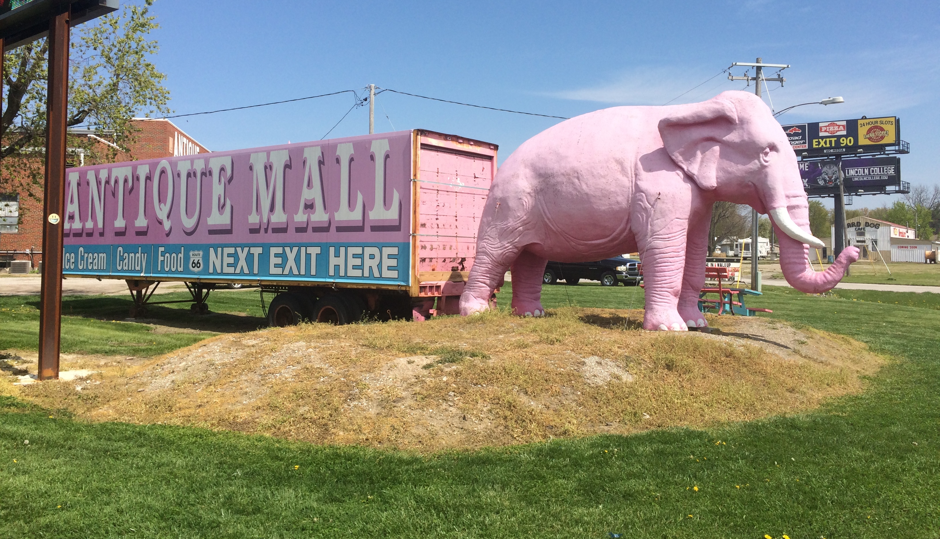
That is, the Pink Elephant Antique Mall northeast of St. Louis, which I’ve driven by many times over the years, but never stopped at. This time I did and it became the cherry on the sundae of the trip.