May Day was a genuine spring day this year, clear and warm enough for the season. I spent some of it on a walkabout in downtown Chicago, starting west of the Loop and wandering more or less east and south until I reached Grant Park. At Congress Pkwy. and Dearborn St., I noticed barricades in front of the Auditorium Theater Building. A long line of people, many of them wearing football jerseys, stood behind them.
Then I remembered hearing on the radio that the NFL draft was being held in Chicago this year, and giving it no more thought. If I had, I’d have guessed it was in a major hotel ballroom somewhere, but it turns out it was in the Auditorium Theatre.
There, and at a large white temporary tent in Grant Park, across Michigan Ave. at Congress. As the NFL’s senior vice president of events, Peter O’Reilly, explains on league’s web site: “Every year we can’t really satisfy the demand for fans that want to be inside the theater, so now we’re creating this Draft Town in Grant Park, just across from the Auditorium Theatre, in order to allow more fans to experience the excitement of the draft.”
The line of people, a block long, was waiting to get into the tent, and I’d bet they paid hard gold coins for the thrill. A large electronic sign on the tent said, “Look, Another Profit Center for the NFL!”
Actually, it said “Chi-Town is Draft Town.”
The sidewalks along Michigan Ave. were lousy with fans wearing football jerseys and lanyards with plastic badges, which probably let them into the tent. Cops were everywhere, presumably to keep a lid on any sports riots later. (Which were probably no new thing even at the time of the Nika Riots.)
The NFL draft wasn’t on my mind when I started walking, and it didn’t remain top of mind very long. I pressed on toward the far southern end of Grant Park, away from crowds, cops and mass-market sports.
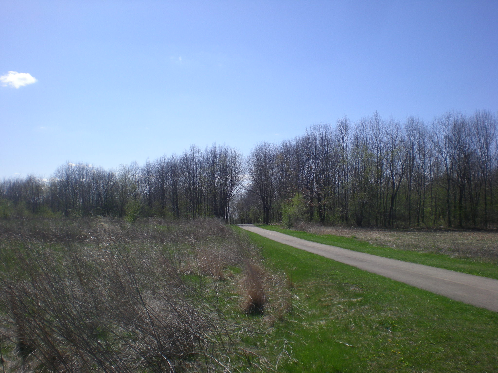
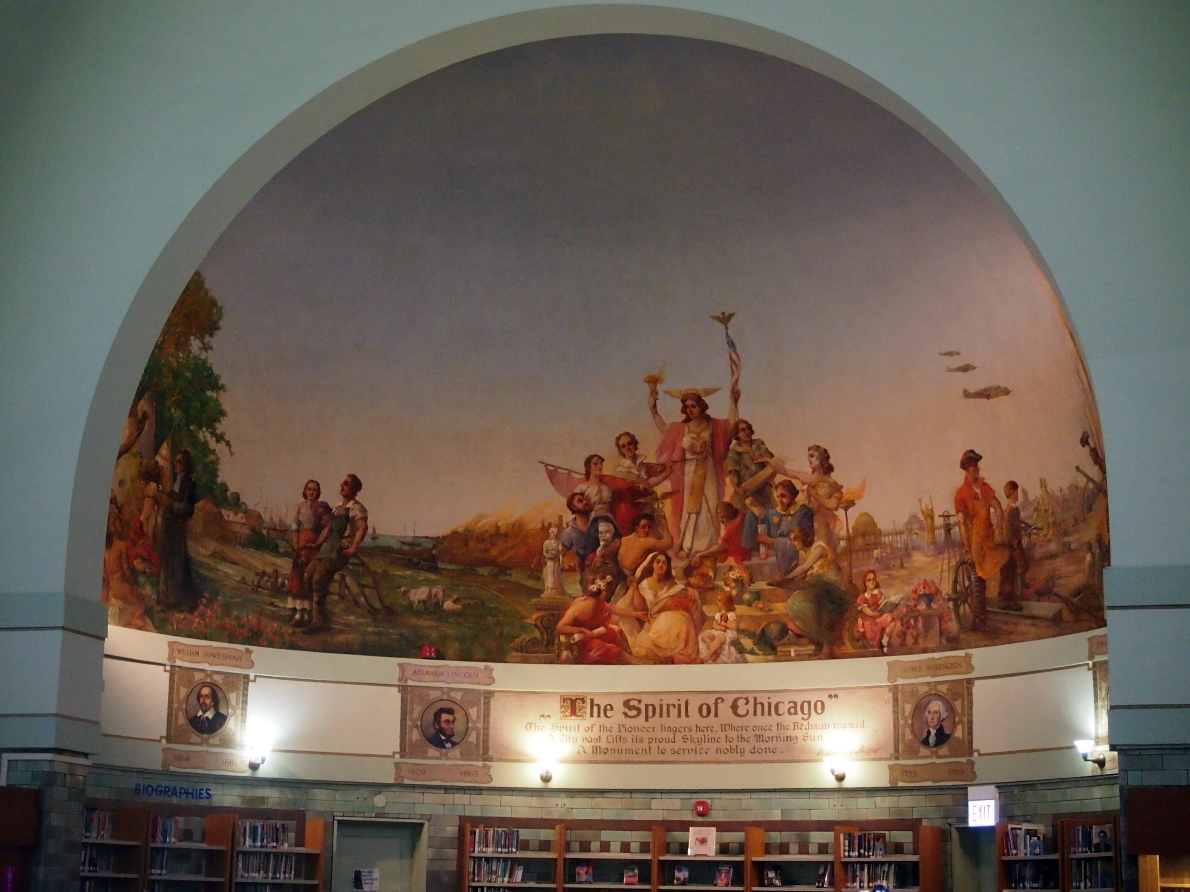
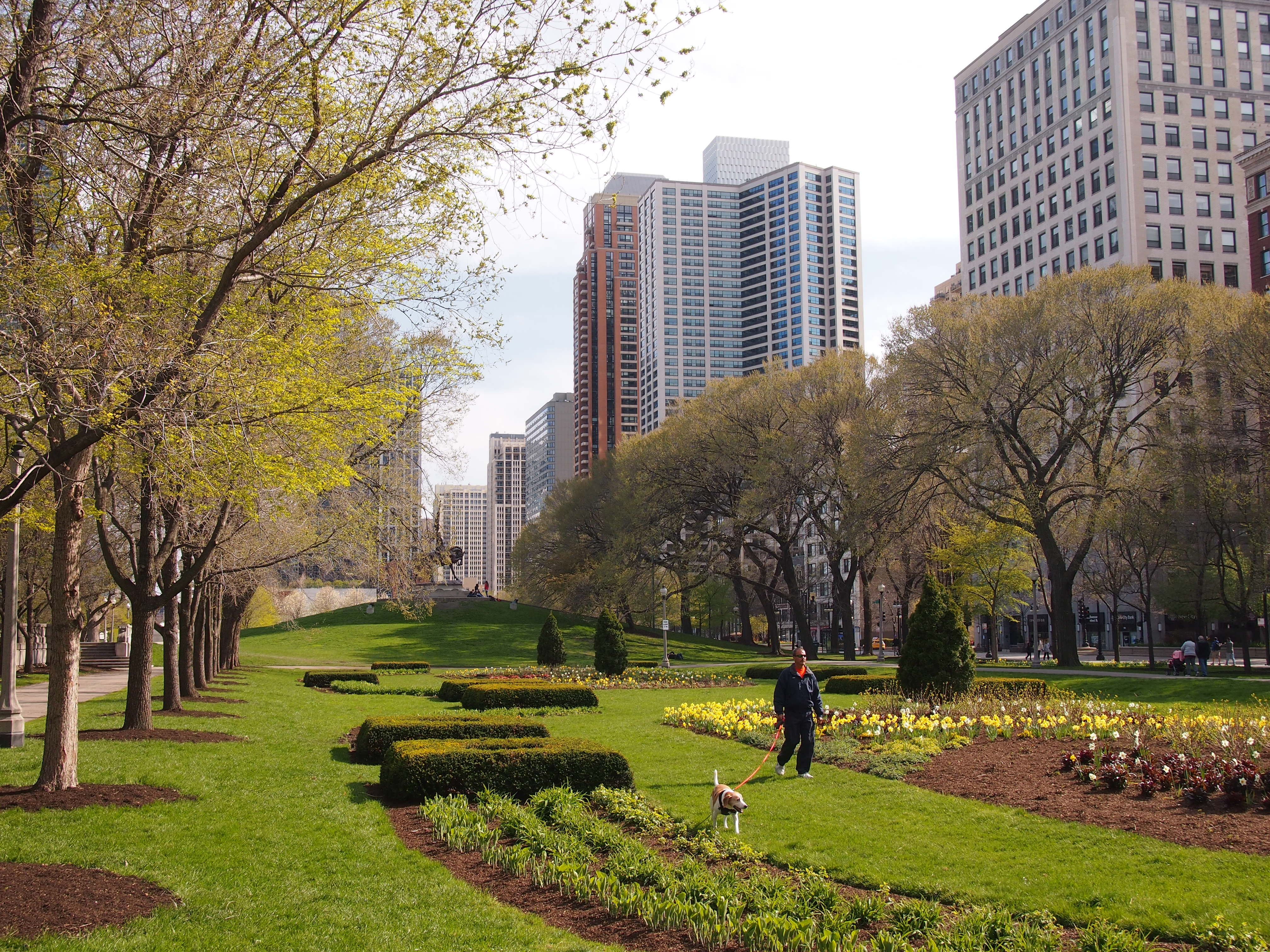 I don’t remember the last time I was in this part of Grant Park. It was a fine place to be on a warm Friday afternoon.


