The Newberry Library Map Mural

I’ve read that the first floor of the Newberry Library on the Near North Side of Chicago is newly renovated, and it did have a newly polished look when Ann and I were there on Saturday. But it’s been a while since I’ve been inside the library, so I don’t really remember what it used to look like.

I’m sure that I’d never seen this intriguing mural before, which is above the landing between the first and second floors near a back entrance to the building.
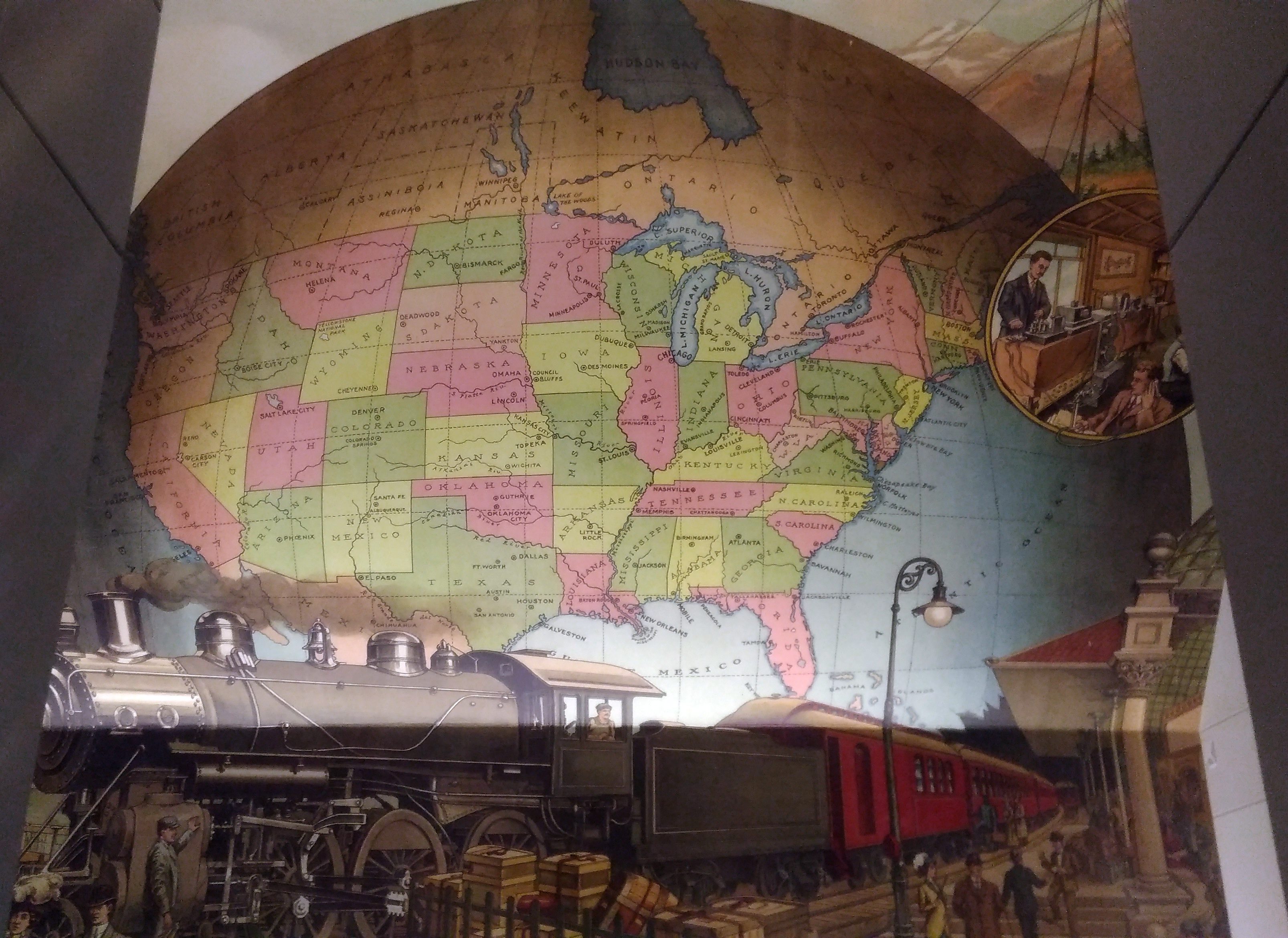
A map mural. Even better, an historic map mural, along with a train at a station under the map and what looks like a telephone and telegraph office in a balloon off to the side.

The mural looks new, so either it is, or maybe an older image was expertly refurbished. I didn’t see any signs or plaques nearby to tell me which, or who the artist is, and the library web site doesn’t seem to say, so for now I’ll let the matter rest. It’s always good to find a map mural.

My guess is that the map depicts the nation ca. 1900 — united by rail, telegraph and the still fairly new telephone, with a new century of progress to look forward to. Or possibly 1887, when the Newberry was founded, or 1893, when the current building opened.

Though not cartographically precise (West Virginia looks especially mashed), the map’s close enough to evoke the United States of the period. One detail I noticed was that South Dakota’s towns were Deadwood and Yankton, even though the territorial capital moved to Bismarck in 1883 (presumably Al Swearengen would then refer to those “c—suckers from Bismarck” rather than Yankton).

Also, note the pre-land boom, pre-drain the Everglades, pre-Disney, pre-Florida Man Florida.
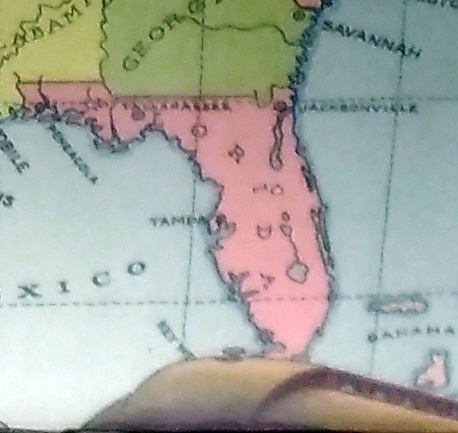
A little fuzzy, but it’s clear that there’s no Miami and no Orlando.

Also, the states depicted were not quite all states at the beginning of the 20th century. Arizona, New Mexico and what became Oklahoma were still territories.

That would be my only quibble: before it became a state, Oklahoma was actually two territories, the Oklahoma Territory and the Indian Territory. The Indians of the Indian Territory wanted to be admitted as the state of Sequoyah, but Congress wasn’t having it, and so the two territories were joined to form the modern state in 1907.

How do I know that the map doesn’t depict borders sometime after 1907? Because of the depiction of Canada.
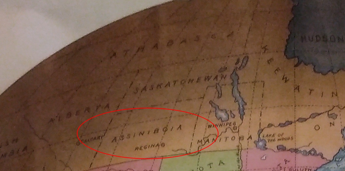
The wonderfully named Assiniboia was a district of the NW Territories, as were Saskatchewan and Athabasca, all before 1905 (Keewatin was a separate territory before 1905, then became a district of the NWT). A major reorg of prairie Canada was done in ’05, making it look mostly like it does now.

So the map depicts pre-1905 Canada, but post-1907 Oklahoma. Ah, well. It’s small quibble about such a fine example of a mural.

The American Geographical Society Library (Or Wow, Look at All the Globes!)

At the University of Wisconsin-Milwaukee’s Golda Meir Library, which is the school’s main library, it isn’t hard to find a bust of the fourth Prime Minister of Israel. She was an alumna of the university’s predecessor institution, Milwaukee State Normal School.
Behind the bust is a mounted Milwaukee Sentinel article, dated August 27, 1987, about the sculptor, Maurice Ferstadt, whom I’ll give credit for not trying to idealize the prime minister’s face. On the morning of February 19 of that year, Ferstadt — who was 75 –finished the sculpture. That evening, he died of an aneurysm.

Part of the library participated in Milwaukee Doors Open last weekend. Special Collections is on the fourth floor. We spent some time there, looking at some of the old and rare books on display. Interesting.

Then we went to the third floor, which is home to the American Geographical Society Library.

The closer I got, the more excited I felt. That’s not a verb I use much in my well-established middle age. But as soon as I entered the library, that rare feeling came over me. This is best thing ever!

You know, that kid on Christmas morning feeling. The giddiness passed, of course, but I remained vastly impressed by the collection all the same.

According to the library’s web site, it “contains over 1.3 million items supporting instruction, research and learning. The collection is global in scope — ranging from the 15th century to present — and includes maps, atlases, books, periodicals, photographic and film media, and geospatial data.”

And I have to add, globes. Look at all the globes! That’s what we looked at most, though there were some fine maps on exhibit too. Old globes, new ones, globes in various languages, small orbs, much larger ones, thematic globes, and globes of the Earth, Moon, the Skies and probably Mars and some other planets that I missed.

What a beaut: a geological globe.

Here’s a relief globe, made in Italy ca. 1950.
I could have looked at and taken pictures of globes all day. Here’s one more. The granddaddy of all the globes in the collection.
The Library of Congress says, “In 1942 in the midst of World War II, U.S. Army Chief of Staff Gen. George C. Marshall sent a large globe to both President Franklin Roosevelt and Prime Minister Winston Churchill as Christmas gifts from the U.S. Army. The U.S. Office of Strategic Services had compiled the maps, and the Weber Costello Co. constructed the globes. It is reported that 12 to 15 of these globes were produced between 1942 and 1955.

“The globe measures 50 inches (127 centimeters) in diameter, 13 feet in circumference, and reportedly weighs 750 pounds. It consists of two interlocking halves made of bent bands of wood over which the printed paper gores are pasted.”

One of the library staff confirmed to me that this indeed was one of those 12 to 15 globes — though not either of those given to Roosevelt or Churchill, since they are at Hyde Park and Chartwell, respectively.

In recent years, the American Geographical Society’s had its globe refurbished. Looks good for its age, I’d say.
As I mentioned, there were maps on display from among the library’s vast collection, laying flat on tables for a convenient look.
There were all kinds of maps, such as one of the rayon acetate (silk-like) escape maps that helped Allied POWs escape during WWII, highway maps, non-English maps, space maps, hobbyist maps, historical trend maps, and comedy maps, such as the MAD Pictorial Map of the United States from 1981, with artwork by the inimitable Sergio Aragonés (who’s still alive).

As fun as that was — and I spent several minutes looking at it, since any Sergio Aragonés work is going to be incredibly detailed — my favorite was a Swiss map: Die Eroberung des Weltraums.

Or rather, a schematic depicting the progress of space exploration as of the publishing date in 1968. Here’s a detail.

Not shown in my detail are the Moon, or Venus and Mars, though spacecraft had voyaged there by ’68. There had been no exploration of the outer planets or Mercury yet, so those weren’t depicted at all. What a remarkable lot of information the artist, whose name I don’t have, was able to pack into the image.

Still in Old Assenisipia

I was looking in a seldom-looked at file of images the other day and found a scan I’d made of a page from a collection of Thomas Jefferson’s writings. I’d forgotten I’d made ir. Here it is.

Nearly 15 years ago, I wrote: “Some years ago, I read a curious little document by Thomas Jefferson, who in 1784 made a report to Congress — the Congress under the Articles of Confederation — about how to create states from the Northwest Territory and what to call them.

“Jefferson suggested 10 states for the area that now contains six (Illinois, Indiana, Kentucky, Michigan, Ohio and Wisconsin). It was an exercise in hyper-rationality and hyperliteracy, though if his suggestions had been used, they would be normal and even venerated names — such is the power of custom.

“Hyper-rational because, instead of paying attention to natural features, Jefferson cut the district into rectangles measuring two degrees of latitude north-to-south and roughly four degrees of longitude east-to-west (‘roughly’ because the irregular Mississippi River forms the western boundary of the territory).

“Besides the Mississippi, geographic form did intrude in what we call lower Michigan — even Jefferson wasn’t going to ignore lakes Michigan and Huron in drawing lines — as well as a few other places on his map, but he was doing his best to apply Longitude and Latitude to the new states’ boundaries. It was as if Colorado- and Wyoming-shaped states were to be created in the Midwest.”

Naturally, other sites discuss this odd collection of non-realized states, such as (of course) Strange Maps.

Roadside Wisconsin, Part 2: Just About 45°N, 90°W

Wausau, Wisconsin, has a pleasant town square, a park surrounded by an assortment of shops and restaurants. No one but me remembered visiting there before, but we did in 2003, taking lunch at the Mint Cafe on the square. This year we went back to the cafe on the way up to the UP, on the last day of June. I think we even sat in the same booth.

The top card is from our ’03 visit. The bottom, from the recent visit. I like the ’03 card better. Less busy.
The Mint Cafe, WausauLunch was just as good this time around. Hamburgers, fish, that kind of thing, in a uncontrived diner atmosphere. No one at the Mint was wearing a tux, as far as I could see.

Afterward we strolled around the square and a nearby street or two. We happened on the office of the Wausau/Central Wisconsin Convention & Visitors Bureau. Mostly we went in to use the restroom, but I also picked up a four-color glossy promo magazine suitably called Wausau, subtitled “Central Wisconsin.” On the off chance that it offered useful information. It did.

The magazine reminded me that not far from Wausau is a sign marking 45°N latitude, 90°W longitude. Or, as the magazine puts it, “Center of the North Half of the Western Hemisphere.” Also included: a nicely detailed map to help you get to that place (and other points of interest).

I learned about the location years ago. I think in high school, or even in junior high, I wondered where those four points on the Earth might be. So I got out the atlas and looked. Two were in remote southern oceans. One was in the absolute middle of nowhere in central Asia. And one was… in Wisconsin.

Years later, a coworker of mine originally from Wisconsin told me about the site — he’d grown up not too far away. And then I read about it, probably on Roadside America. Even so, I would have forgotten to visit on this trip had the magazine not reminded me. I was inspired. If we can stand on the Prime Meridian and Lilly can stand on the Equator, then by gar, we can stand at 45°N, 90°W.

So on July 2, after lunch again in Wausau on the way home — this time at a sandwich shop, part of a small local chain — we headed west on I-29 out of Wausau. The map’s directions are clear. I-29 west to Exit 150, then take Wisconsin H north to Wisconsin U, turn west. Follow U as it curves north and then curves west again. A sign marking 45°N, 90°W will be just past the second curve.

So we followed the directions. Got to the second curve. And then: nothing. No easily visible sign anyway. I’d had a somewhat hard time explaining to the rest of my family what we were doing out in the farm fields of central Wisconsin, when we could have been heading home, so things got a little testy in the car.

We turned around and went for another look, noticing a fellow mowing the grass around his house on a large riding mower (the rest of the nearby area was farmland). We stopped and rolled down our passenger side window, and looked his direction.

At once he took his earphones off, hopped off the mower, and came toward us. He looked the part of a modern farmer: a large man about my age in overalls and a short-sleeved shirt, with a pink face and gray in his hair. He also looked genuinely glad to see us.

“I’ll bet you know what we’re looking for,” I said.

He did. He explained that Marathon County had removed the existing sign just the week before, as part of putting a sign in the correct place. I had read that the sign wasn’t exactly at 45°N, 90°W. It was about 1,000+ feet off. Back whenever the county had first installed the sign, no one had GPS, so that wasn’t an issue. Now it is. (This is an issue for the tourist Equator and Prime Meridian, too.)

“They didn’t seem to think anyone would miss the sign,” he said. “I told them people come looking for it every day.”

The sign might be gone, but the original survey marker was still in embedded in concrete at the site, he said. He told us where to look. Remarkable how the mood in the car changed for the better after our short chat with a friendly farmer.

Before long we were there. This is what we found.

45°N, 90°W Marathon County, Wisconsin45°N, 90°W Marathon County, WisconsinIt might not be exactly 45°N, 90°W, but I wasn’t about to not stand at the point. Yuriko and Ann did too, in their turn. By now everyone was game.
45°N, 90°W Marathon County, WisconsinThe small temporary sign near the marker, to the right of me in the picture, was erected by Marathon County. It says:

45°N-90°W Geographic Marker
Site currently under
construction/relocation
Reopening September 12, 2017

There’s also a helpful map of the planned new site fixed to the temporary sign. The old site will be a small parking lot, with a path, or maybe a paved path, leading to the new and presumably GPS-correct marker.

On July 2, work had already started on the path.
45°N, 90°W Marathon County, WisconsinWe didn’t walk the 1,000 or so feet to the new site. If we’re ever back this way — and this part of central Wisconsin would make a good long weekend someday — we’ll surely take a look at the new marker.

You could think of it as a ridiculous tourist attraction, considering how arbitrary it is. After all, the Prime Meridian would be running through Paris had the French had their way — 2°20′14.03″ to the east, which would put 45°N, 90°W pretty close to, or even in, Green Bay. The body of water, not the town. I’m not going to figure it out exactly, though.

Somehow, I like the arbitrariness. It also reminds me that I’d like to visit Four Corners, too, which is even more arbitrary.

Vanity Map Update

Time to post the vanity map of states I’ve been to, color-coded, because there are updates. Mainly, South Carolina is now filled in. That makes 49 states and DC, leaving large lonely Alaska.

Color-coded Map 2017

Color codes are the same, and pretty much idiosyncratic.

Green: Either lived in these places or visited so many times I’ve lost count. Very familiar.

Blue: Numerous visits covering a fair amount of the state or province, or one or two visits of strong intensity and some variety. Fairly familiar.

Orange: Spent the night at least once, saw a relatively limited number of places.

Pink: Passed through (on the ground) but didn’t spend the night.

White (no color): Never visited.

Vanity because it isn’t as if I studied hard and passed a battery of tests to gain entry, or crossed dangerous frontiers, or defied longstanding cultural prejudices, to be able to visit 49 states and DC. All it took was some time and some money, and the will do to so. Not everyone has those things, of course, but many millions do. Even so, it hasn’t cost a fortune, especially spread out over the 35-plus years of my adulthood (there’s no state I visited as a child that I didn’t return to later).

Moreover, this is the late 20th and early 21st centuries we’re talking about. Air travel might have its petty irritations and highways and bridges might be in sad need of repair in places, but on the whole the North American travel infrastructure is an easy-to-use marvel in our time. Just think: about five miles from my house is a highway (Interstate 90) on which I could, if I had a hankering to, drive through to Boston. Or if I went the other way, take the road all the way to Seattle in a few days, probably without more than intermittent delays.

Map Hero’s Laminated Gitche Gumee

You never know what’s lurking in the fine print. Usually that’s taken to be a bad thing, but yesterday I took a look at a map I’ve owned for years and discovered a fine thing in the fine print.

First, the map. It’s laminated, and so in excellent shape. I got it when we went up to northern Wisconsin in 2003. At 16¾ inches x 10⅝ inches, it’s beyond the capacity of my simple scanner, so here’s a large detail from the midsection of the map: instantly recognizable as the ice-water mansion Lake Superior.
LakeSuperiorLake Superior Port Cities Inc., publisher of Lake Superior Magazine, published the map in 2001. It’s a quietly gorgeous map whose shadings not only indicate elevation above and below the surface of the lake, but are pleasing to the eye. Besides towns and roads, it notes all of the various state forests and parks along the shores of Lake Superior, plus the national lakeshores and the single national monument, Grand Portage in Minnesota.

Here’s a closeup of Keweenaw Peninsula, the UP’s UP, and a place I surely must see.
KeweenawVery small versions of the Lake Superior Circle Tour sign mark a network of roads that circumscribe the lake. If I had the time, that’s a drive I wouldn’t hesitate to do. I remember the first time I visited Lake Superior — Labor Day weekend 1989 — I was driving between Munising and Marquette and I saw one of the signs. I hadn’t realized there was a Lake Superior version of the drive; the Lake Michigan Circle Tour signs can be seen even in the Chicago area and, in fact, I’ve done my own version of circum-driving that lake twice (once was that ’89 weekend).

Instantly I was taken with the notion of driving around Lake Superior. I was by myself and could have done it. I didn’t have my passport, but you didn’t need a passport to visit Canada in those days. I hadn’t planned to take any time off after Labor Day, but I could have called in sick for a few days, something I very rarely did. But no. I was entirely too responsible.

On the lake itself, the map also features lighthouses and the sites of notable shipwrecks. Some of the lighthouses are probably easy enough to see, but others are impossibly remote, such as the Stannard Rock Light, more than 20 nautical miles southeast of Keweenaw Point, slap in the middle of the lake.

As the for the wrecks, few will ever see them in the chilly Superior waters (average temp, 40 degrees F.). The most famed of them, naturally, is the Edmund Fitzgerald, but it has a lot of company, such as the Onoko, Henry Steinbrenner, John Owen, Western Reserve, Gale Staples, Niagara, Superior City and others.

A handful wrecks are marked but also noted “went missing,” such as the Owen and Manistee. To quote Wiki on that ship: “The Manistee was a packet steamship that went missing on Lake Superior on November 10, 1883. It was presumed to have sunk, with no surviving crew or passengers. The cause remains a mystery, and the wreckage was never discovered.” Sometimes Gitche Gumee just eats ships, it seems.

As for the fine print, way at the bottom right corner of the map, in about 3-point print, it says, “Design/Cartography by Matt Kania.” He’s easy enough to find: Map Hero, maker of custom maps. Looks like he’s done a lot of wonderful maps besides Superior. If I had any talent for it, I’d do the same.

Michelin’s Central Texas

Here’s another map of considerable usefulness and aesthetic value. This is a detail from the Michelin 2015 North America Road Atlas.

CentralTexasI bought the 2003 edition back when it was new, but by last year it was worn out, so I replaced it. Instead of providing a map or two for each state, as the larger Rand McNally does, Michelin divides North America into a grid of squares. Central Texas above happens to be on square 61. The system takes some getting used to, but on the whole it works.

I also still buy Rand McNally most years. Some things on those maps won’t be on Michelin and vice-versa, though since Rand McNally is 15¼ inches x 10¾ inches, and Michelin is 8 x 11, the former has more room for detail. Yet Michelin packs an amazing amount of detail, as good maps should.

CentralTexasThen there are state highway maps. In whatever state I pass through, I try to pick up one. They were always easy to find in Texas — every rest stop with bathrooms used to have them, and maybe still do. The lesson is, you can’t have too many maps.

Without maps around the house, how could you browse? Looking at the Texas 61 map just now, I notice towns I’ve never heard of — at some distance from San Antonio, where I know most of the surrounding burgs — including the likes of Bleiblerville, Blue, Concrete, Ding Dong, Gay Hill, North Zulch, Oxford, Snook, and Sublime. All real Texas town names, according to Michelin.

Nelles Maps Hong Kong

When you Google huuuge (three u’s), you get this.

Four u’s, this.

That came to mind as I looked out my back door earlier today to see the results of the day’s near-unremitting rain. Huuuge puddles. Maybe even huuuuge.

Nelles Maps are, or at least were in the 1990s, beautiful to behold. While in Asia during that decade, I discovered that the company, which is based in Munich, offers excellent maps of certain Asian places, such as city maps of Hong Kong and Bangkok, and larger maps of Thailand and Malaysia and Bali.

I see from looking around that Nelles still makes those maps, plus a fair number of other places in Asia, Africa and the Americas. None of Europe unless you count Madeira, and none of the United States, except for no fewer than four Hawaiian maps: the Big Island, Honolulu & Oahu, Kauai, and a state of Hawaii map. (What, no Maui?) Guess the company’s specialties are places Germans are likely to consider exotic for machen Urlaub.

Here’s a detail of the Hong Kong map I probably picked up in 1990: Victoria Harbour, flanked by Hong Kong Island to the south and Tsim Sha Tsui, often known as TST, to the north.
HongKongI suspect 1990 because the Cultural Centre in TST is marked as under construction. That would put the publication of the map in the late 1980s, since the center was completed in 1989, complete with a plaque unveiled by Charles and Diana.

A closeup of TST.

HongKongTSTEven if I’d never been there before — and after over 20 years, it’s like that — I’d look at this map and think, how interesting. The Star Ferry Terminal. HK Space Museum. HK Museum of Art. The Mariners Club. Kowloon Mosque. Streets called Hankow, Haiphong, Hanoi, Humphrey, Cameron and of course Nathan Road.

One thing I missed in TST was the Avenue of the Stars, which is on the waterfront and celebrates the HK film industry. If you want to see a statue of Bruce Lee, apparently that’s your place. The reason I missed it was that it didn’t open until 2004. Shucks.

bản đồ thế giới

Word is there will be cold rain tomorrow. At least it won’t be snow, and at least it’s the beginning of the end of winter. Today was sunny and above freezing. So cloudless, in fact, that I was inspired to take a picture of the clear blue sky.

Feb 1, 2016 Sky Over IllinoisI don’t know if I’ve ever taken that kind of picture before. Clouds, yes. Trees in front of a clear sky, yes. But straight up azure? It was surprisingly hard to get the camera to take the shot, I suppose since the sensors don’t sense anything nearby to focus on.

One thing I did over the weekend was thumb through some of my maps. I can’t quite call it a collection, since there’s no system to it, and I haven’t been going out of my way to acquire them over the years. Mainly they’ve been useful purchases, such as in London or Berlin, and they’ve accumulated.

My Vietnamese-language world map, on the other hand, was a souvenir. I’m pretty sure I got it in Saigon. At the top it says it’s a bản đồ thế giới, except it’s all capitals. But it does feature some of the intricate diacritical marks that characterize Vietnamese.

Here’s Vietnam’s neighborhood.

VietMap2And North America.

VietMapIn case you need to know it, the United States is Hoa Kỳ in Vietnamese. I’m just guessing, but that seems to be a translation of “united states.” Look at the map enough, though, and you’ll see many of the place names seem to be phonetic.

Map in the Mail

Medecins Sans Frontiers wants money from me, and toward that end sent me a map of the world specially printed for them by Rand McNally. That’s a pretty good way to get my attention. It’s not quite as aesthetic as one by National Geographic or Nelles, but not bad. But you’d think that for an organization that has “without borders” in its name, national borders would be left off the map to make a point. Instead, the nations of the Earth are variously hued, as on any political map.

Fine print on the side of the map is at pains to say that the lines and colors on the map don’t mean that the organization takes a position one way or the other on any of them. It also specifically mentions Sudan and South Sudan — a “final boundary… has not been determined” — and that “a dispute exists between the Government of Argentina and the United Kingdom concerning sovereignty over  the Falklands Islands (Malvinas).”

Mentioning Sudan and South Sudan, I understand, since I’m pretty sure the organization is active there. But the Falklands? Why a note about that and not, say, the West Bank or the Western Sahara or the Spratlys or just about anywhere else that’s disputed? Such spots are just about everywhere, though this map doesn’t show that some disputes are more intense than others.

Also: the map is a Gall stereographic projection. Looks like Rand McNally doesn’t mention Peters, and from what I can tell, this one doesn’t look as weirdly distorted as either Mercator or the maps I’ve seen called Peters projections. Speaking of which — here’s xkcd on maps.